
The Ultimate Guide to Home Office Color Psychology
Your home office isn’t just where you work anymore.
It’s your creative sanctuary. Your productivity powerhouse. And let’s be honest – it’s probably your Zoom backdrop more often than you’d like to admit.
But here’s what most people don’t realize: the colors surrounding you are quietly influencing every email you send, every idea you brainstorm, and every video call you take. Science has proven that home office colors can literally rewire your brain for better focus, enhanced creativity, and improved mood.
Ready to discover which hues will transform your workspace into a productivity paradise? Let’s dive into the fascinating world of color psychology and unlock your office’s hidden potential.
The Science Behind Home Office Colors and Your Brain
Your brain processes color faster than text or shapes – we’re talking milliseconds here. When you walk into your home office, your mind is already making snap judgments about how you should feel and perform based on the colors around you.
Researchers at the University of British Columbia found that different colors activate distinct parts of our brains. Blue tones stimulate the prefrontal cortex, the area responsible for focus and analytical thinking. Meanwhile, red hues fire up the detail-oriented regions, making you more meticulous but potentially more anxious.
Here’s where it gets interesting: your gender, age, and personal experiences also influence how colors affect you. Women tend to have stronger emotional responses to color than men, and those responses can vary significantly based on cultural background and personal associations.
The Color-Productivity Connection
- Cortisol levels drop by 15% in rooms painted with cool, calming colors
- Creative output increases by 25% when exposed to certain green tones
- Eye strain reduces by up to 40% with properly chosen office color schemes
- Video call confidence improves by 30% with strategic background color choices
Blue: The Ultimate Focus Enhancer
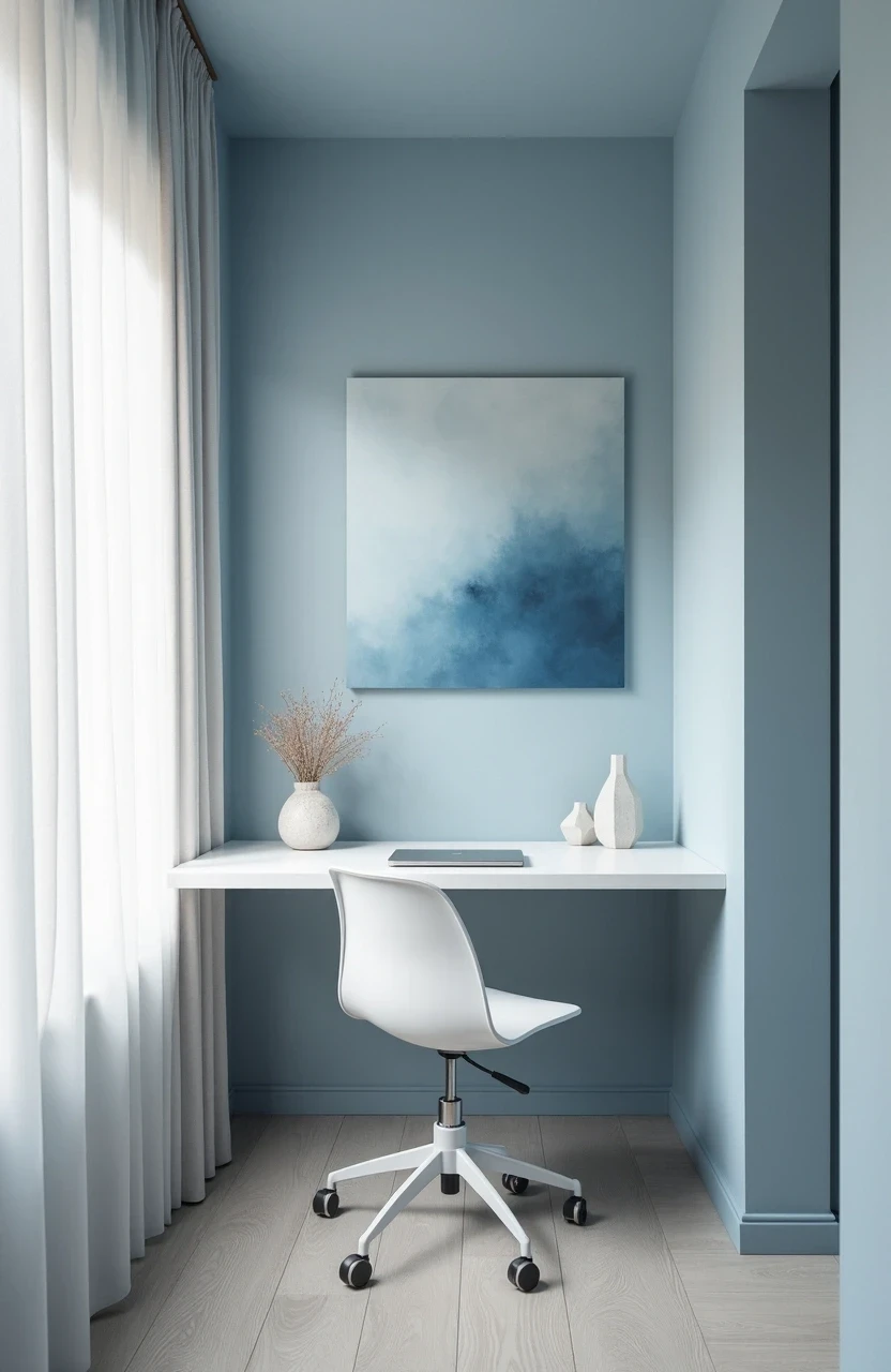
If productivity had a color, it would probably be blue. This isn’t just design intuition talking – it’s hard science.
Studies consistently show that blue environments enhance cognitive performance and mental clarity. Think about it: when you stare at a clear blue sky, your mind naturally feels more expansive and focused. The same principle applies to your workspace.
The Best Blues for Your Home Office
Navy Blue: Creates a sense of authority and professionalism. Perfect for client calls and serious work sessions, but use it sparingly to avoid feeling boxed in.
Sky Blue: Promotes calm focus without being overwhelming. This shade works beautifully as an accent wall behind your desk.
Powder Blue: Gentle and soothing, ideal for high-stress work environments. Great for spaces where you need to think creatively while staying grounded.
Periwinkle: The perfect blend of blue and purple, offering focus with a touch of creativity. Excellent for writers and designers.
How to Incorporate Blue Without Going Overboard
You don’t need to paint your entire office blue to reap the benefits. Try these subtle approaches:
- Paint one accent wall in a medium blue tone
- Add blue artwork or prints above your desk
- Choose blue office accessories like desk organizers or lamp bases
- Incorporate blue textiles through curtains or a desk chair

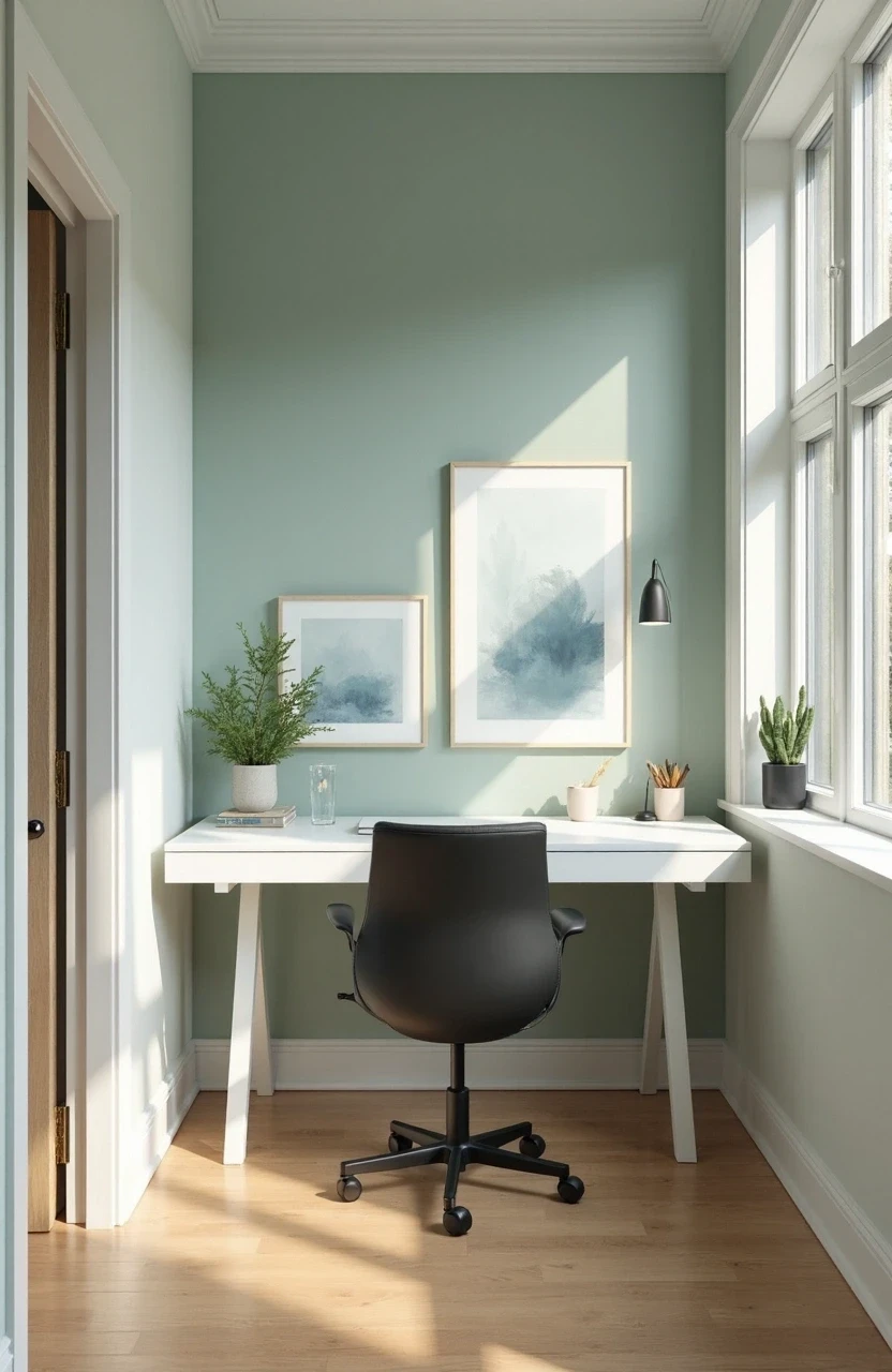
Green: Nature’s Productivity Booster
Green is having a major moment in interior design, and for good reason. This color literally tricks your brain into thinking you’re in nature, which reduces stress hormones and boosts creative thinking.
The magic of green lies in its position on the color spectrum. It requires the least amount of eye adjustment, making it the most restful color for prolonged viewing. Translation: you can stare at green walls all day without getting fatigued.
Shades of Green That Actually Work
| Green Shade | Best For | Mood Impact |
|---|---|---|
| Sage Green | Creative work, brainstorming | Calm, balanced, refreshing |
| Forest Green | Detail-oriented tasks | Grounded, focused, serious |
| Mint Green | Long work sessions | Energizing, optimistic, clear |
| Olive Green | Video calls, client meetings | Sophisticated, trustworthy, warm |
The Biophilic Design Connection
Adding green to your home office taps into biophilic design principles – the idea that humans have an innate connection to nature. Even if you live in a concrete jungle, surrounding yourself with natural greens can:
- Lower blood pressure during stressful work periods
- Improve air quality perception (even if actual air quality remains the same)
- Increase feelings of well-being and job satisfaction
- Reduce mental fatigue by up to 20%
Gray: The Sophisticated Neutral That Actually Energizes
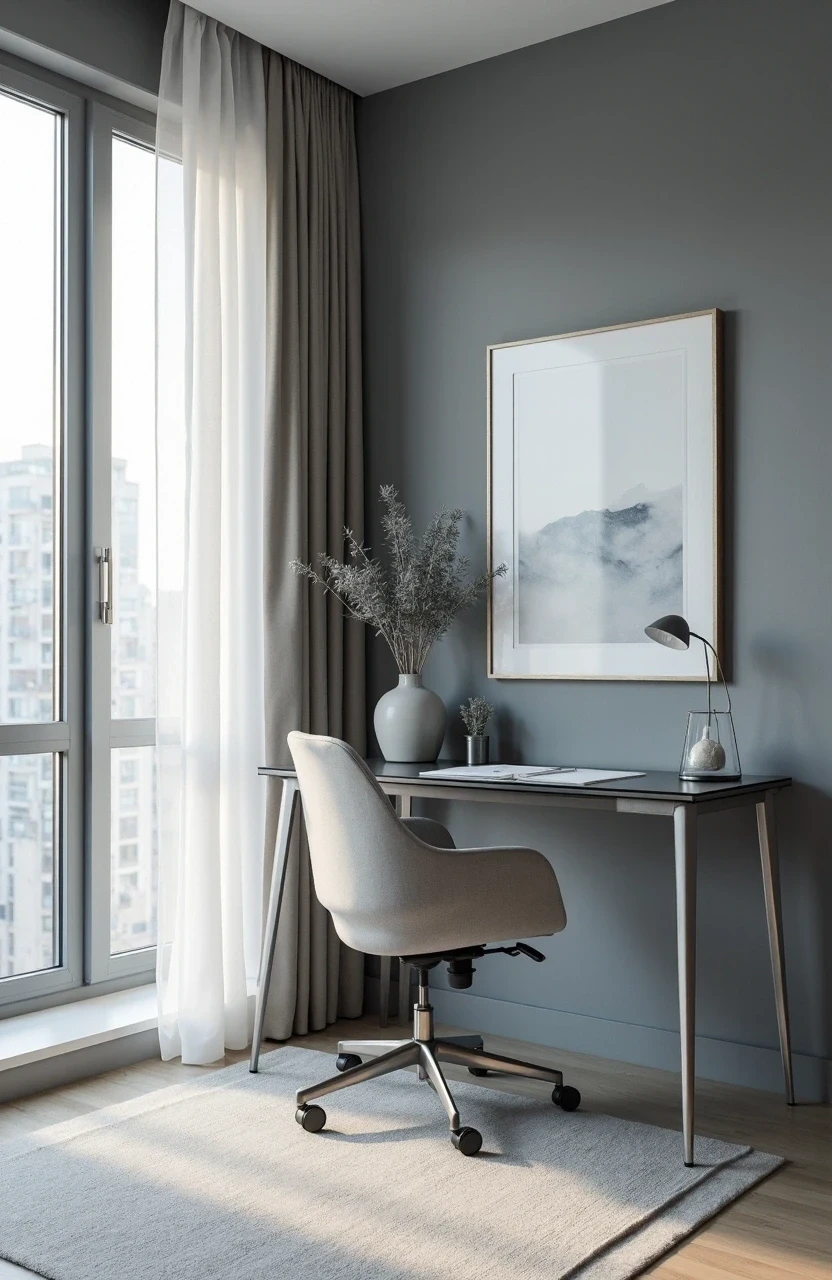
Gray gets a bad rap for being boring, but the right shade can create a sophisticated backdrop that makes you feel like the boss you are.
Modern gray tones – think warm charcoals and soft pewters – provide a neutral canvas that won’t compete with your computer screen or cause visual fatigue. Plus, gray photographs beautifully on video calls, making your skin tone appear more even and professional.
Warm vs. Cool Grays
Warm Grays (with undertones of beige, brown, or yellow):
- Create a cozy, inviting atmosphere
- Work well in north-facing offices with limited natural light
- Pair beautifully with wood furniture and brass accents
Cool Grays (with blue, green, or purple undertones):
- Feel more modern and crisp
- Complement natural light beautifully
- Create a clean, minimalist aesthetic that reduces visual clutter
Making Gray Work Without Feeling Depressed
Gray can feel dreary if not balanced properly. Here’s how to keep it sophisticated rather than sad:
- Layer in plenty of white and cream accents
- Add pops of color through artwork and accessories
- Ensure adequate lighting – gray needs good illumination to shine
- Include warm textures like wood, brass, or natural fibers

White and Cream: The Clean Slate Champions
There’s something undeniably powerful about a crisp, clean workspace. White and cream create a sense of unlimited possibilities – like a blank canvas waiting for your next brilliant idea.
These light neutrals reflect the most light, making small home offices feel larger and brighter. They also provide the perfect backdrop for colorful artwork, plants, and personal touches that make your space uniquely yours.
The Psychology of Light Colors
White and cream activate the same brain regions associated with:
- New beginnings and fresh starts
- Clarity of thought and decision-making
- Feelings of spaciousness and freedom
- Reduced visual overwhelm and stress
But here’s the catch: pure white can sometimes feel sterile or cold. The trick is choosing whites with subtle undertones that warm up the space.
Choosing the Right White
Not all whites are created equal. Consider these popular options:
- Alabaster: Warm and creamy, perfect for creating a cozy-professional vibe
- Cloud White: Clean but soft, works in any lighting condition
- Swiss Coffee: Slightly yellow undertones that feel welcoming
- Dove White: A hint of gray that feels modern and sophisticated
Colors to Avoid (And Why They’re Sabotaging Your Success)
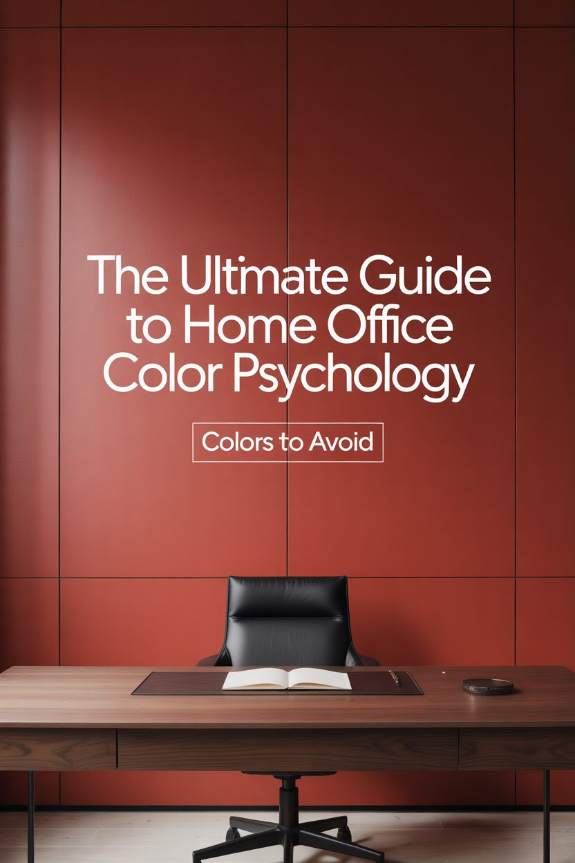
Some colors might look Instagram-worthy, but they’re productivity killers. Here are the shades that science says you should skip:
Red: The Double-Edged Sword
Red increases heart rate and can trigger stress responses. While it might boost energy initially, prolonged exposure often leads to:
- Increased anxiety and agitation
- Difficulty concentrating on complex tasks
- Higher error rates in detail-oriented work
- Elevated blood pressure during long work sessions
Bright Yellow: The Overwhelmer
Despite being associated with happiness, bright yellow can be mentally exhausting. Studies show that people make more mistakes in yellow environments and report feeling more frustrated.
Purple: The Creativity Killer
While purple can inspire creativity in small doses, large amounts often feel overwhelming and can actually inhibit logical thinking – not ideal when you’re trying to meet deadlines.
Dark Colors: The Energy Sappers
Deep, dark colors like burgundy or dark brown can make you feel sluggish and unmotivated. They absorb light and can create a cave-like atmosphere that’s counterproductive for most work tasks.
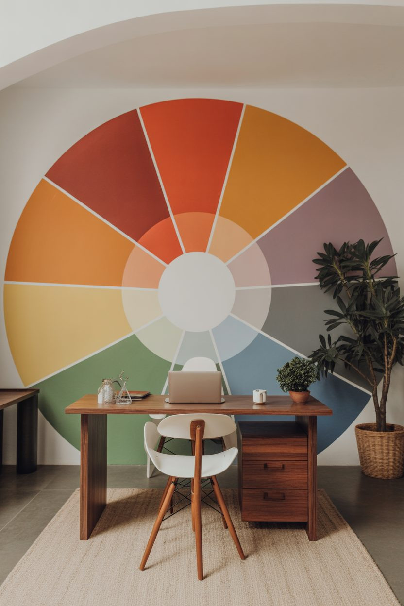
Creating the Perfect Color Palette for Video Calls
Let’s face it – your home office background is now part of your professional image. The colors behind you on video calls can influence how colleagues and clients perceive your competence and trustworthiness.
Colors That Make You Look Professional on Camera
Soft Blue-Gray: Creates a calming, trustworthy backdrop that makes your skin tone appear even and professional.
Warm White: Provides a clean, organized appearance without washing you out on camera.
Sage Green: Offers a sophisticated, on-trend look that photographs beautifully in various lighting conditions.
Light Taupe: A warm neutral that feels approachable yet professional.
Video Call Color Mistakes to Avoid
- Bright white walls: Can cause glare and make you appear washed out
- Bold patterns: Distract from your message and can cause visual vibration on screen
- Very dark colors: Make the space feel cramped and can cast unflattering shadows
- Neon or fluorescent colors: Look unprofessional and can cause eye strain for viewers
Personalizing Your Home Office Colors
The most productive workspace is one that reflects your personality while supporting your work style. Consider these factors when choosing your home office colors:
Your Work Type Matters
Creative professionals (designers, writers, marketers):
- Benefit from inspiring colors like soft greens and calming blues
- Can handle more adventurous color choices
- Should incorporate colors that spark joy and imagination
Analytical professionals (accountants, engineers, researchers):
- Need colors that promote focus and reduce distractions
- Work best with neutral palettes and minimal color variation
- Should prioritize function over dramatic design statements
Client-facing professionals (consultants, coaches, therapists):
- Require colors that appear trustworthy and professional on video
- Need backgrounds that won’t distract from conversations
- Should choose colors that make clients feel comfortable and confident
Consider Your Natural Light
North-facing offices benefit from warm colors that add energy, while south-facing spaces can handle cooler tones that balance abundant natural light.
Bringing It All Together: Your Color Psychology Action Plan
The perfect home office color scheme isn’t about following trends – it’s about creating an environment that supports your unique work style and makes you feel confident and capable.
Start with one accent wall in your chosen primary color, then layer in complementary tones through accessories, artwork, and furniture. Remember, you don’t need a complete renovation to transform your workspace. Sometimes the smallest changes create the biggest impact on your daily productivity and professional presence.
Your home office should work as hard as you do – and now you have the color psychology knowledge to make that happen.