
Your Guide to Creating Living Room Palettes That Actually Work
Let’s be honest. You’ve probably stood in the paint aisle, overwhelmed by the endless sea of whites that all look identical under those harsh fluorescent lights.
Sound familiar?
Living room colors are not just about what looks pretty on Pinterest. They’re about creating a space that feels authentically you. A place where you can curl up with your morning coffee, host friends for wine night, and still feel proud when unexpected guests drop by.
This guide breaks down everything you need to know:
- How to choose a color palette that won’t look dated next year
- The psychology behind colors (and why it matters more than you think)
- Practical tips for coordinating walls, furniture, and those accent pieces you can’t resist buying
Understanding Color Psychology in Your Living Space
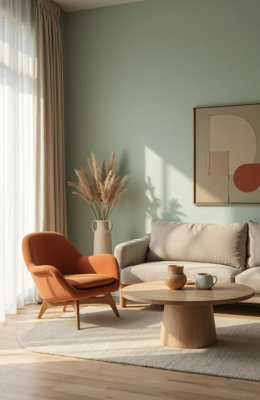
Colors aren’t just visual – they’re emotional. And your living room? It’s essentially the emotional headquarters of your home.
Think about it this way: you wouldn’t wear the same outfit to a board meeting and a beach vacation. Same logic applies to living room colors. Each hue triggers different feelings and energy levels.
Warm colors (reds, oranges, yellows) are like that friend who’s always ready for adventure. They energize spaces and make rooms feel cozy and intimate. But too much, and you might feel like you’re living inside a sunset – beautiful, but intense.
Cool colors (blues, greens, purples) are the zen masters of the color world. They calm, relax, and make spaces feel larger. Perfect for creating that serene sanctuary vibe you see in all those Scandinavian design blogs.
Neutral colors are the Swiss Army knife of interior design. They’re versatile, timeless, and play well with others. Think of them as your reliable foundation – not boring, just dependable.
Here’s what research tells us about popular living room colors:
| Color | Psychological Effect | Best For |
|---|---|---|
| Blue | Reduces stress, lowers heart rate | Relaxation-focused spaces |
| Green | Promotes balance, reduces eye strain | Rooms with lots of screen time |
| Warm Gray | Creates calm sophistication | Modern, minimalist styles |
| Beige | Provides comfort and stability | Traditional, cozy atmospheres |
| White | Enhances focus, creates openness | Small spaces, maximalist decor |
The key? Choose colors that match how you want to feel in your space, not just how you want it to look on Instagram.
The 60-30-10 Rule: Your Color Distribution Game Plan
If color theory feels like calculus, the 60-30-10 rule is your calculator. It’s foolproof, flexible, and used by designers everywhere.
Here’s how it works:
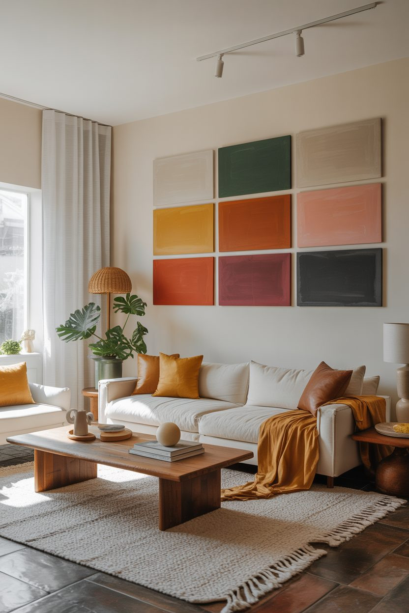
- 60% dominant color – This is your room’s foundation (usually walls and large furniture)
- 30% secondary color – Your supporting cast (accent chairs, curtains, area rugs)
- 10% accent color – The jewelry of your room (throw pillows, artwork, decorative objects)
Let’s say you’re working with a neutral base. Your breakdown might look like:
- 60%: Warm white walls and a beige sectional
- 30%: Navy blue curtains and an area rug with navy accents
- 10%: Coral throw pillows and a few small decorative pieces
This formula prevents any single color from overwhelming your space. And it gives you permission to experiment with that bold accent color you’ve been eyeing without committing your entire room to it.
The beauty of this rule? It works with any style. Whether you’re into maximalist boho or minimalist modern, the proportions keep everything balanced and intentional.
Neutral Palettes That Don’t Put You to Sleep
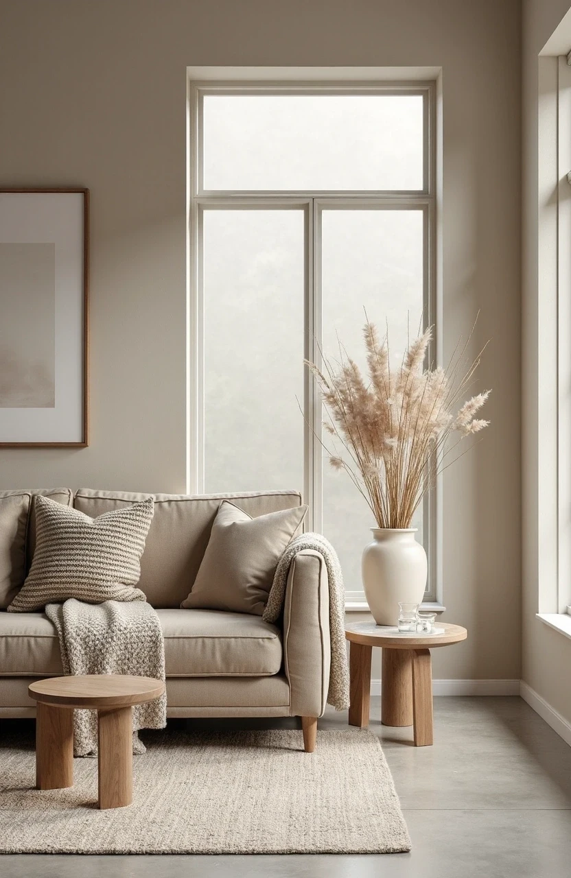
Neutral doesn’t have to mean boring. In fact, the most sophisticated living rooms often rely on carefully curated neutral palettes with subtle variations in tone and texture.
The trick is layering different shades within the same color family. Think of it like creating a monochromatic outfit – you’re working with variations of the same theme, but each piece adds depth and interest.
Warm Neutrals:
- Cream, mushroom, and soft taupe
- Add warmth with honey-colored wood tones
- Incorporate brass or copper accents for richness
Cool Neutrals:
- Light gray, dove gray, and charcoal
- Pair with black and white photography
- Introduce silver or chrome hardware for consistency
Earthy Neutrals:
- Sage green, warm beige, and soft brown
- Bring in natural textures like jute and linen
- Add plants for organic color variation
The secret sauce? Texture mixing. A neutral room with smooth leather, nubby wool, polished wood, and matte ceramics feels infinitely more interesting than one that’s all the same finish.
And don’t forget about white – but make it interesting. Pure white can feel sterile, but warm whites like “Cloud White” or “Ivory” create that effortless elegance you’re after.
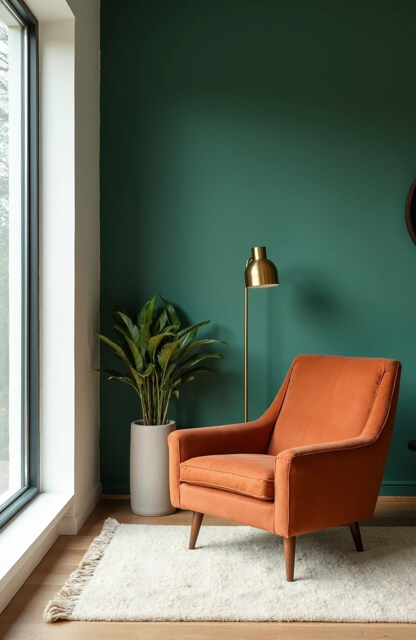
Bold Color Combinations That Stand the Test of Time
Ready to be brave? Bold doesn’t have to mean trendy. Some color combinations have been making rooms gorgeous for decades because they’re based on solid color theory principles.
Complementary Colors (opposites on the color wheel):
- Navy blue and warm orange
- Deep green and soft coral
- Purple and golden yellow
These combinations create natural contrast and energy. But here’s the key – use different saturations. Instead of bright orange with bright blue, try a muted terracotta with a deep navy.
Analogous Colors (neighbors on the color wheel):
- Blue, blue-green, and green
- Red, red-orange, and orange
- Yellow, yellow-green, and green
These palettes feel harmonious and sophisticated. They’re perfect if you want color without the drama.
The Unexpected Neutrals:
Some colors act like neutrals but add more personality:
- Soft black (yes, it exists)
- Warm gray-green
- Mushroom brown
- Deep navy
These “almost neutrals” give you the flexibility of neutral colors but with more character. They’re especially great if pure neutrals feel too safe for your personality.
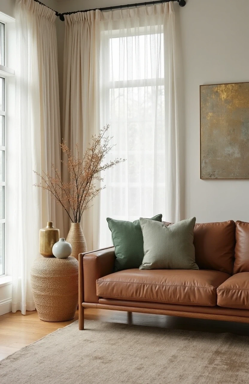
Seasonal Flexibility: Colors That Adapt Year-Round
Nobody wants to redecorate every season. But you can choose living room colors that feel fresh year-round and adapt easily to seasonal styling.
Base Colors for Seasonal Flexibility:
- Warm whites that look crisp in summer, cozy in winter
- Medium-toned grays that pair with both cool and warm accents
- Soft sage greens that work with autumn oranges and spring pinks
- Deep navy that’s sophisticated with winter metallics, fresh with summer corals
The magic happens in your seasonal accent swaps:
Spring/Summer:
- Lighter throw pillows in coral, soft yellow, or fresh green
- Natural fiber rugs in jute or sisal
- Fresh flowers and plants for natural color
Fall/Winter:
- Richer textures in deeper tones
- Warm metals like brass and copper
- Cozy throws in burgundy, forest green, or warm orange
This approach lets you satisfy your decorating urges without major overhauls. You get the satisfaction of seasonal change without the commitment (or expense) of new furniture.
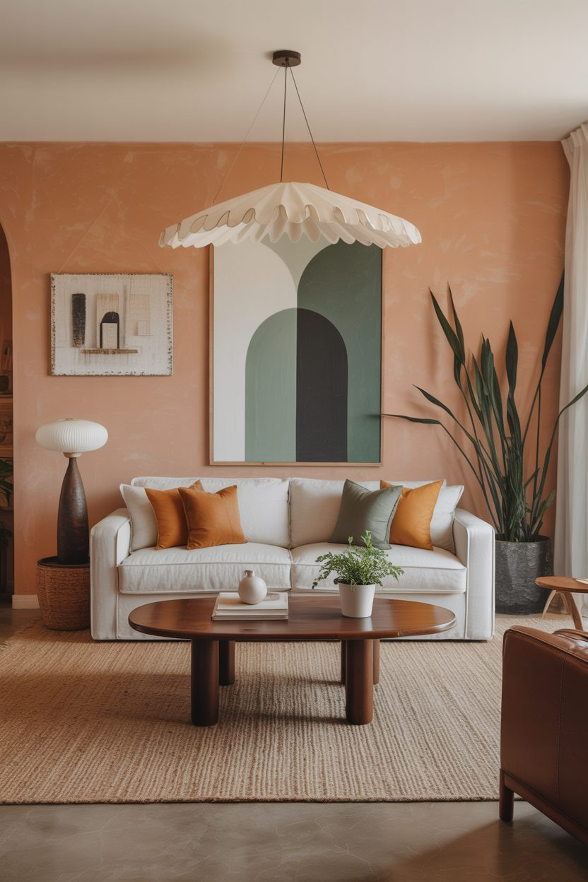
Furniture Selection: Making Your Color Palette Work
Your sofa will probably outlast three paint colors and countless throw pillow phases. Choose wisely.
Investment Pieces (sofas, chairs, dining tables) should lean neutral or classic. This doesn’t mean boring – think rich navy instead of electric blue, or warm charcoal instead of stark black.
Mid-Range Pieces (coffee tables, side tables, lamps) can introduce your secondary colors. These items are easier to replace if your tastes change, but substantial enough to anchor your color scheme.
Easy-Change Elements (pillows, throws, artwork) are where you can go bold. This is your 10% accent color territory.
Here’s a practical approach: If you’re drawn to a bold furniture color, live with it in smaller doses first. Love that emerald green? Try it in throw pillows for six months before committing to the accent chair.
And consider the longevity factor. That millennial pink chair might feel dated sooner than you’d like. But a dusty rose? That’s got staying power.
Lighting’s Impact on Your Color Choices
Here’s something they don’t tell you at the paint store: lighting can make or break your color palette. That perfect gray you chose? It might look purple under your current light bulbs.
Natural Light Changes Everything:
- North-facing rooms get cooler, blue-tinted light
- South-facing rooms get warm, golden light
- East rooms are bright in morning, cooler in afternoon
- West rooms are cooler in morning, warm and golden in evening
Artificial Light Matters Too:
- Warm LED bulbs (2700K-3000K) make colors appear warmer
- Cool LED bulbs (4000K-5000K) make colors appear cooler
- Incandescent bulbs add yellow undertones to everything
The Smart Strategy:
Test your paint colors in different lighting conditions. Paint large swatches on different walls and observe them throughout the day. What looks perfect at noon might look completely different at 7 PM under your table lamps.
For living rooms, most designers recommend warm white bulbs (around 2700K) for ambient lighting. They’re flattering to skin tones and make colors feel rich and inviting.
Common Color Palette Mistakes (And How to Avoid Them)
Even design-savvy women make these mistakes. The good news? They’re all fixable.
Mistake #1: Matching Everything Exactly
That perfectly matched furniture set? It can look showroom-stiff instead of lived-in lovely. Mix different shades within your color family instead.
Mistake #2: Forgetting About Undertones
That “neutral” beige might have pink undertones that clash with your gray sofa. Always consider undertones when selecting colors.
Mistake #3: Going Trendy with Big Purchases
Millennial pink was having a moment, but moments pass. Save trends for easily changeable elements.
Mistake #4: Ignoring Your Home’s Architecture
A ultra-modern color palette might feel off in a traditional colonial. Work with your home’s natural style, not against it.
Mistake #5: Choosing Colors You Don’t Actually Like
Just because a color is “on-trend” doesn’t mean it belongs in your space. Choose colors that make you happy.
The fix for most of these? Take your time. Live with paint samples for at least a week. Consider how colors work with your existing pieces. And trust your instincts – if something feels off, it probably is.
Bringing It All Together: Your Action Plan
Creating a cohesive living room color palette doesn’t happen overnight. But it doesn’t have to take forever, either.
Start with what you have. Look at your existing furniture, artwork, and accessories. What colors are already working in your space?
Choose your neutral base. This is your 60% – walls and major furniture pieces. Pick something you can live with long-term.
Select your secondary color. This is your 30% – the color that adds personality without overwhelming.
Have fun with accents. This is your 10% playground. Change these seasonally or whenever inspiration strikes.
Test before you commit. Paint samples, fabric swatches, and returnable accessories are your friends.
Remember, the best living room color palette is one that makes you smile every time you walk into the room. It should feel like home – not like a magazine spread you’re afraid to touch.
The goal isn’t perfection. It’s creating a space that reflects your personality and supports the life you actually live.