
18 Fall Color Palette Living Room Ideas in Warm Tones
Fall is calling. And your living room is ready to answer.
The leaves are changing, temperatures are dropping, and your space needs that seasonal refresh that makes everyone want to curl up with a good book. Fall color palette decor isn’t just about throwing some orange pillows around and calling it seasonal.
It’s about creating depth. Warmth. That perfect balance between cozy and sophisticated.
Here’s what you’ll discover:
- Rich, unexpected color combinations that go way beyond basic autumn
- How to layer warm tones without making your space feel overwhelming
- Budget-friendly ways to transform your living room for the season
- Color schemes that work year-round (because nobody has time to redecorate every three months)
Ready to make your living room the kind of space people never want to leave? Let’s dive in.

Rust and Cream Sophistication
This combination is like a perfectly aged leather jacket – effortlessly cool and gets better with time. Rust brings that earthy warmth while cream keeps things from feeling too heavy.
Try a rust-colored accent wall behind your sofa with cream furniture and natural wood accents. The key is balance – use rust as your statement color in about 20% of the space, cream as your neutral base, and let natural textures fill the gaps.
Deep Forest Green with Gold Accents
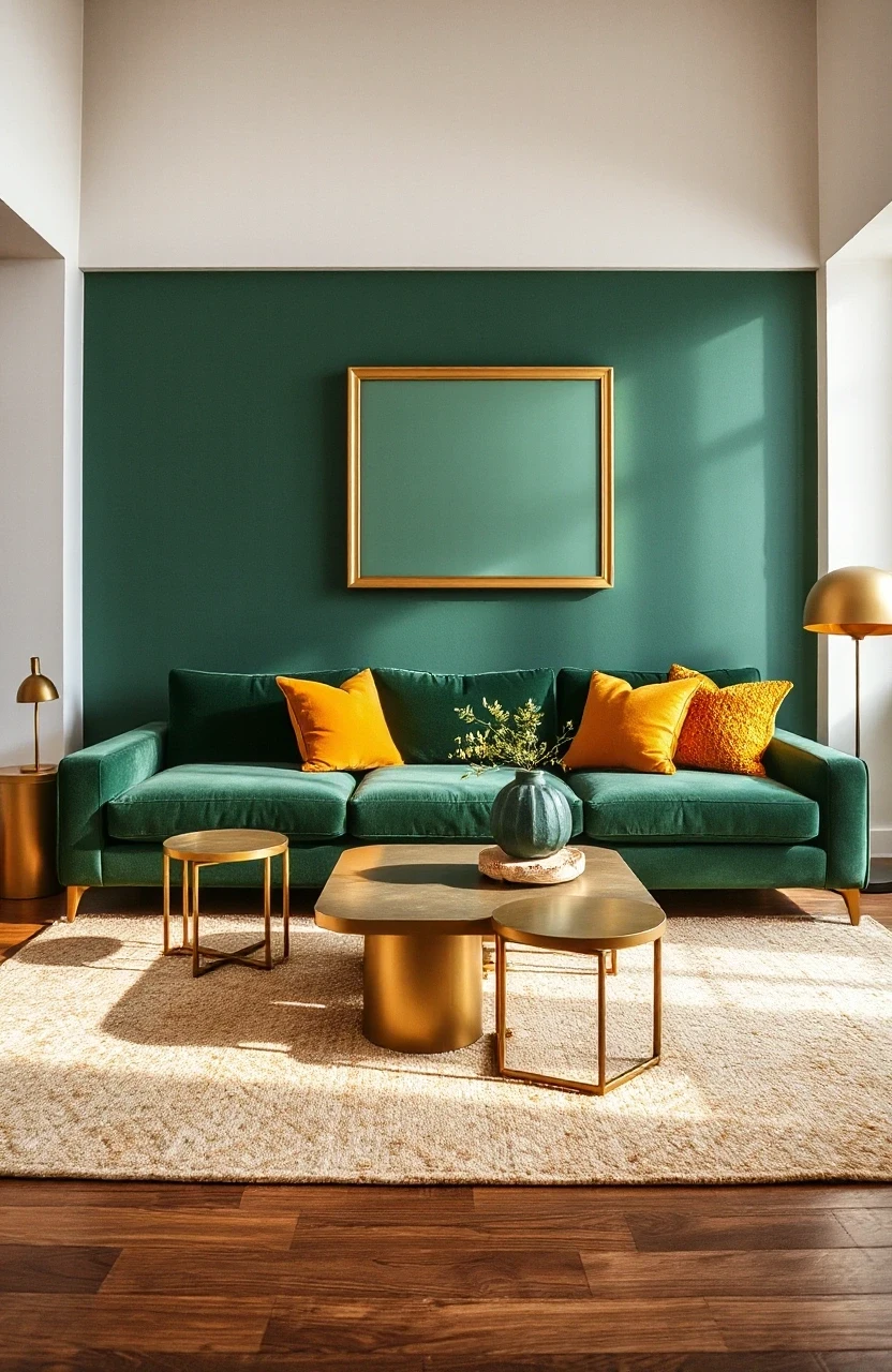
Forest green is having a moment, and for good reason. It’s sophisticated enough for year-round use but feels perfectly fall when paired with warm gold metallics.
- Choose one major green piece (like a velvet sofa or large area rug)
- Add gold through lighting fixtures, picture frames, and small accessories
- Include natural wood tones to bridge the gap between green and gold
- Layer in cream or ivory to prevent the space from feeling too dark
Burnt Orange and Navy Blue Drama
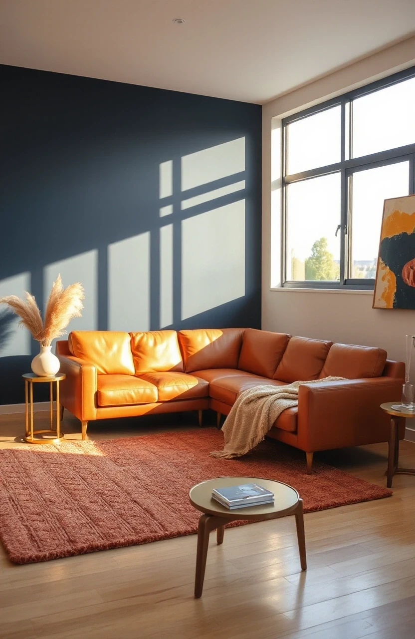
This isn’t your typical fall pairing, but trust the process. Navy grounds the vibrancy of burnt orange and creates a space that feels both energetic and calming.
Use navy as your primary neutral – think navy sofa or accent chairs. Then punch it up with burnt orange pillows, throws, and artwork. Add brass or copper accents to warm up the navy and complement the orange.
Terracotta and Sage Green Harmony
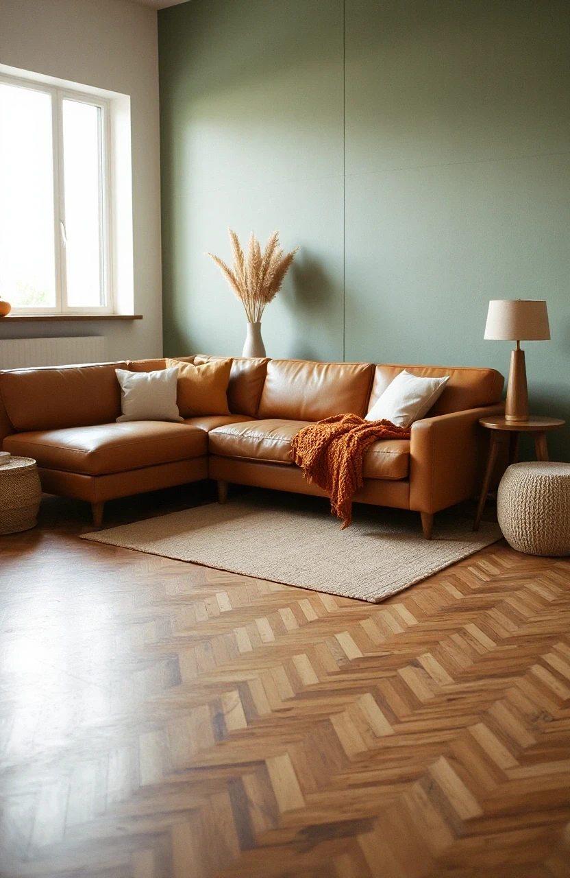
Terracotta has moved way beyond southwestern themes. When paired with soft sage green, it creates an earthy palette that feels both modern and timeless.
Consider terracotta as an accent wall color or in your choice of pottery and decorative objects. Sage green works beautifully in upholstery and larger textile pieces. Natural jute and linen textures complete this organic look.
Warm Gray with Cinnamon Spice
Gray doesn’t have to be cold. The right warm gray paired with cinnamon spice tones creates a sophisticated fall color palette that works in any style home.
Choose grays with brown undertones rather than blue ones. Layer in cinnamon through leather furniture, wooden accessories, and warm-toned artwork. This combination is perfect if you prefer subtle seasonal changes.
Plum and Champagne Elegance
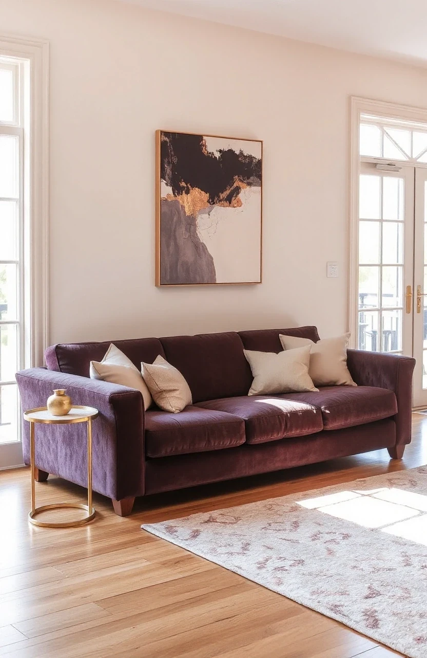
Plum brings unexpected richness to fall decor without screaming “autumn.” Champagne metallics add just enough glamour to keep things interesting.
- Use plum sparingly – in pillows, artwork, or a single accent chair
- Incorporate champagne through light fixtures, mirrors, and small decorative objects
- Keep larger furniture pieces in neutral tones
- Add texture through velvet, silk, or other luxe fabrics
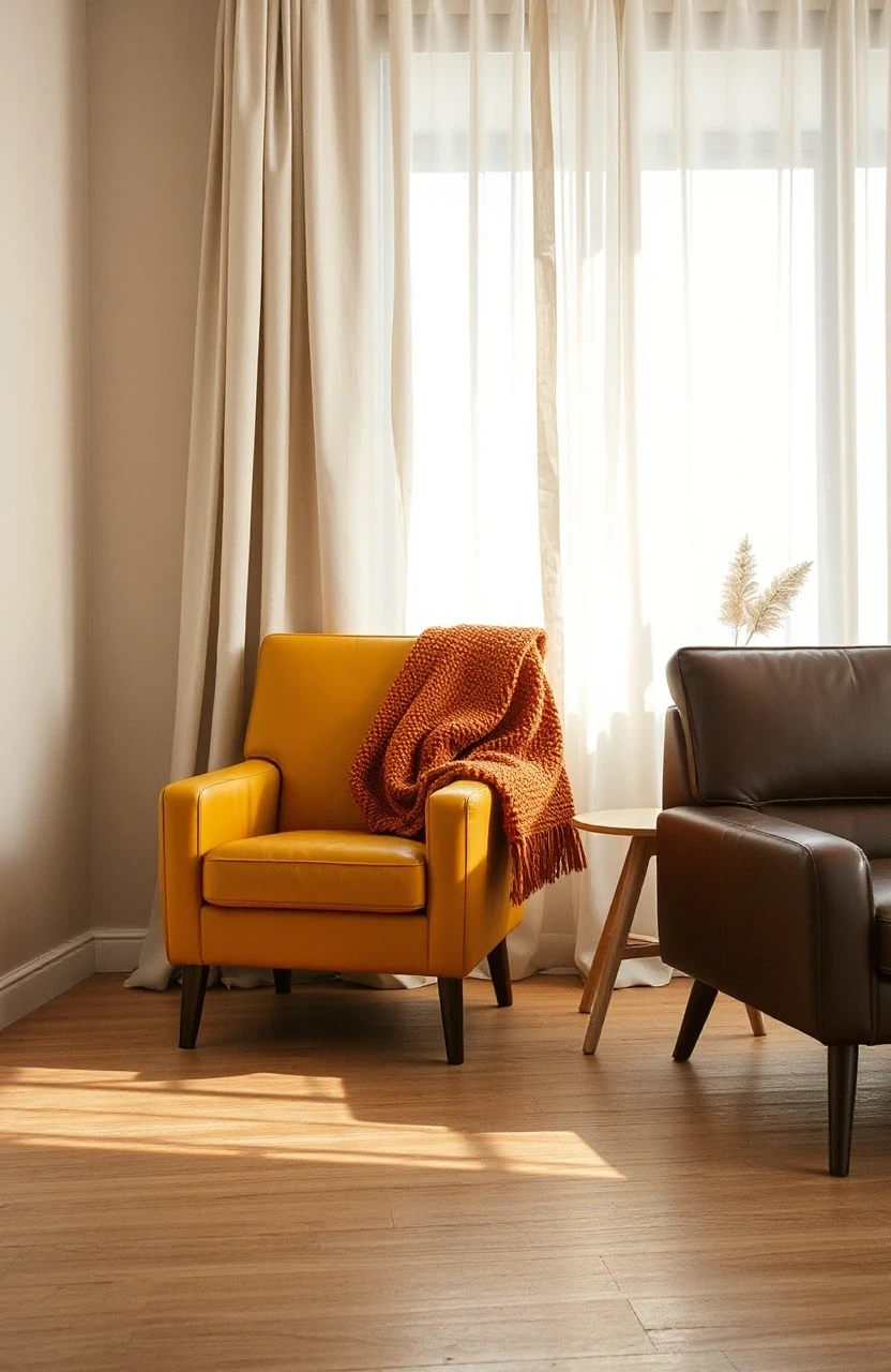
Mustard Yellow and Chocolate Brown
This classic combination feels like a warm hug. Mustard yellow brings energy while chocolate brown grounds the space with sophisticated depth.
Try a chocolate brown sectional with mustard yellow pillows and throws. Add natural elements like wood side tables and woven baskets to soften the boldness of these two strong colors.

Copper and Cream Minimalism
Sometimes fall color palette decor is about restraint. Copper and cream create warmth without overwhelming your space with busy patterns or too many colors.
Focus on copper accents – lighting, planters, picture frames. Keep furniture and walls in various shades of cream and white. This approach works especially well in smaller living rooms where too much color can feel overwhelming.

Burgundy and Taupe Sophistication
Burgundy is fall’s answer to classic navy. It’s rich enough to make a statement but sophisticated enough for elegant spaces.
Use burgundy as an accent color rather than the dominant shade. A burgundy area rug, some throw pillows, or artwork can transform a taupe-based room into something special for fall. Add gold or brass accents for extra warmth.

Caramel and Ivory Comfort
This combination is like the perfect latte – warm, comforting, and never goes out of style. Caramel brown brings richness while ivory keeps things light and airy.
| Color | Percentage | Best Used In |
|---|---|---|
| ——- | ———— | ————- |
| Ivory | 60% | Walls, major furniture |
| Caramel | 30% | Accent furniture, rugs |
| Natural Wood | 10% | Accessories, frames |
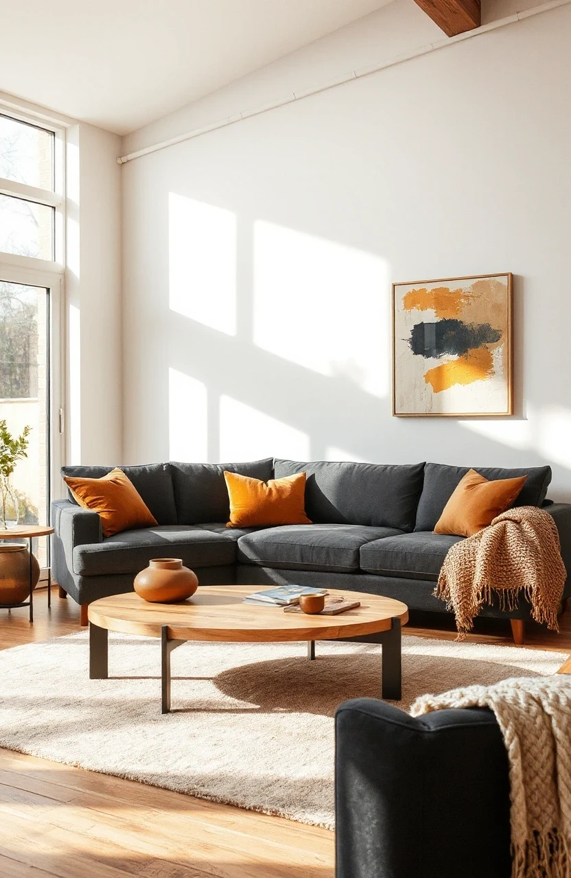
Amber and Charcoal Contrast
Amber tones paired with charcoal create a sophisticated fall palette that feels more urban than rustic. This combination works particularly well in modern or industrial-style homes.
Use charcoal as your neutral base – walls, major furniture pieces. Then warm it up with amber through lighting (literally and figuratively), glassware, and textile accents. The contrast keeps things interesting.
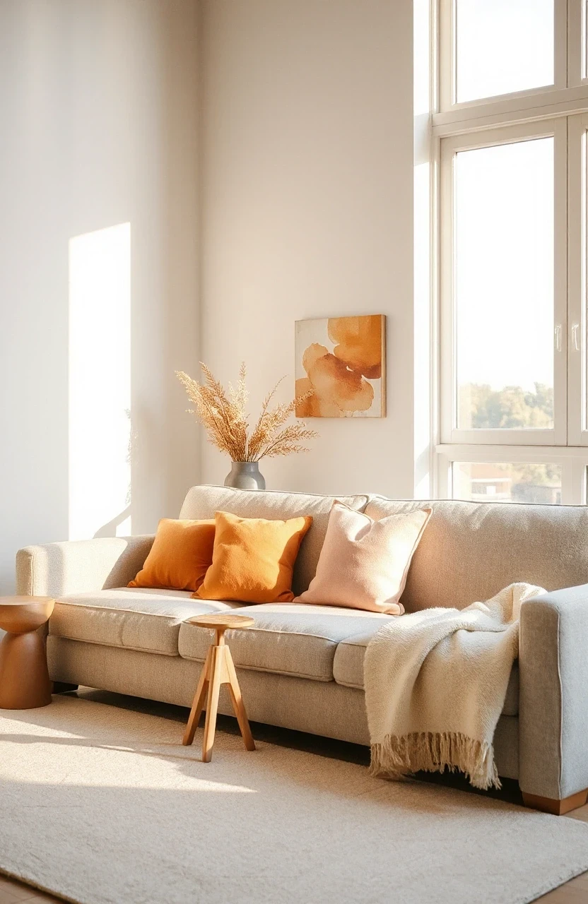
Sunset Orange and Soft Pink
Hear us out on this one. Soft pink might not scream “fall,” but when paired with sunset orange, it creates a warm, sophisticated palette that feels fresh and unexpected.
Keep the pink very soft – think blush or dusty rose rather than hot pink. Use it in smaller doses through pillows or artwork while letting sunset orange take center stage in larger pieces like area rugs or accent chairs.
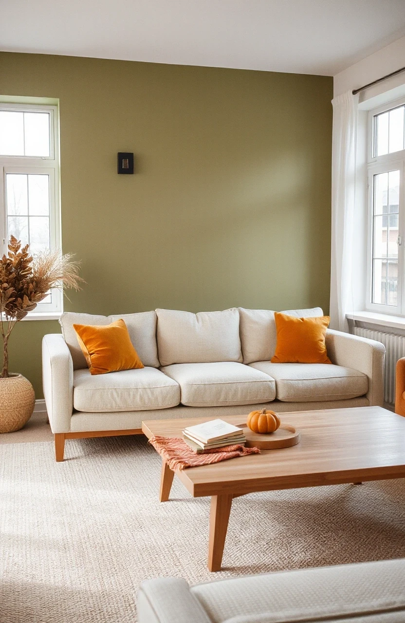
Olive Green and Warm Beige
Olive green is fall’s most underrated color. Paired with warm beige, it creates an earthy, organic palette that feels both calming and sophisticated.
- Choose olive green for larger textile pieces – curtains, area rugs, or upholstery
- Use warm beige as your neutral base for walls and larger furniture
- Add natural wood and woven textures to enhance the organic feel
- Include small touches of brass or gold for warmth
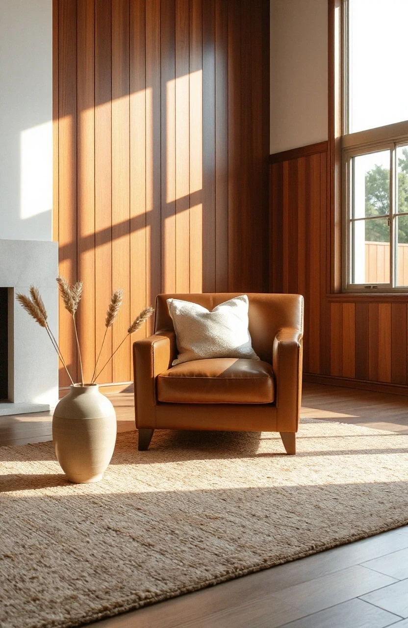
Mahogany and Cream Classic
This timeless combination brings traditional elegance with fall warmth. Mahogany wood tones paired with cream create a space that feels both classic and cozy.
Focus on incorporating mahogany through furniture pieces – coffee tables, side tables, or built-in shelving. Keep walls and upholstery in cream tones, and add warmth through lighting and natural textures.
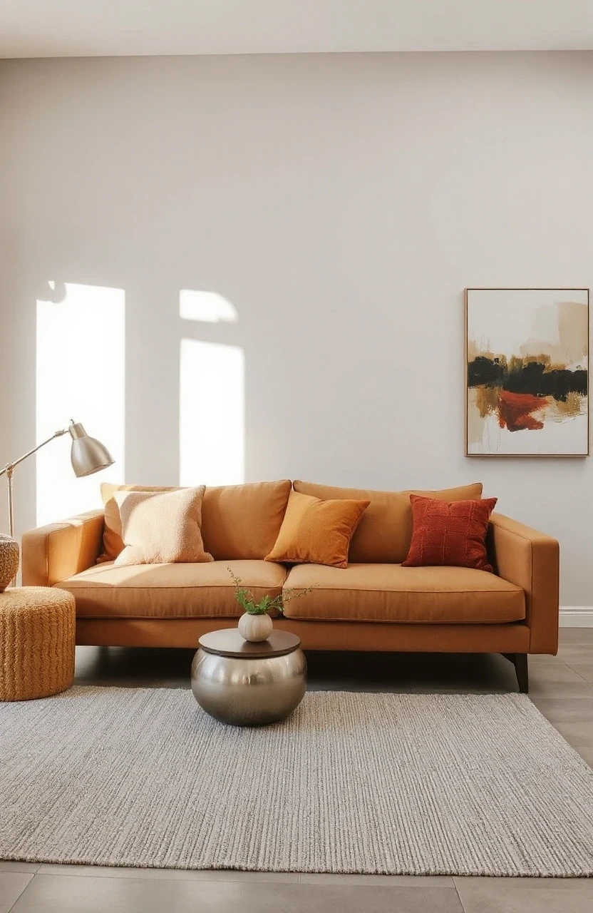
Spiced Pear and Soft Gray
Spiced pear is like mustard yellow’s sophisticated older sibling. Paired with soft gray, it creates a fall color palette that’s warm but not overwhelming.
Use spiced pear as an accent color in textiles and accessories. Soft gray works well for larger pieces and creates a calming backdrop. This combination is perfect for creating a cozy reading nook or conversation area.
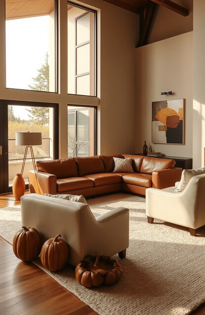
Cognac and Cream Leather Luxury
Nothing says fall sophistication like cognac leather. Paired with cream tones, it creates a living room that feels like an expensive hotel lobby – in the best way.
Consider a cognac leather sofa as your statement piece. Surround it with cream walls, neutral area rugs, and natural wood accents. Add plants and books to keep the space from feeling too formal.
Cinnamon and Sage Balance
Cinnamon brings warmth while sage keeps things grounded. This combination creates a fall color palette that’s both energizing and calming – perfect for spaces where you both entertain and relax.
Try cinnamon in your choice of wood tones and warm metallics. Use sage for textiles and larger accent pieces. Natural materials like jute, linen, and unfinished wood help blend these colors seamlessly.

Golden Honey and Charcoal Modern
Golden honey tones paired with charcoal create a modern fall palette that works especially well in contemporary homes. The contrast keeps things interesting while maintaining sophistication.
Use charcoal for major furniture pieces or an accent wall. Bring in golden honey through lighting, decorative objects, and artwork. This combination photographs beautifully and creates great visual depth.