
Kitchen Color Schemes That Actually Work: From Cabinets to Countertops
You know that feeling when you walk into someone’s kitchen and think, “Wow, everything just… works?”
It’s not magic.
It’s not even luck.
It’s a well-thought-out color scheme that brings together cabinets, countertops, backsplashes, and hardware in perfect harmony. And honestly? You can create that same feeling in your own space.

Here’s what we’re diving into:
- Foolproof color combinations that never fail
- How to coordinate every element without overthinking it
- Real-world examples that actually work in everyday kitchens
- Hardware choices that make or break your design
Let’s turn your kitchen into that space everyone notices – for all the right reasons.
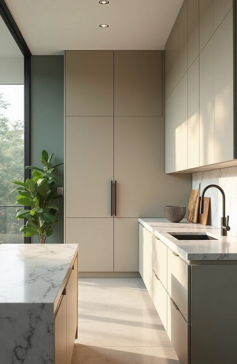
The Foundation: Understanding Kitchen Color Psychology
Before we jump into specific schemes, let’s talk about why certain colors work together and others… well, don’t.
Your kitchen isn’t just a room – it’s the heart of your home. The colors you choose affect everything from your morning coffee mood to how inviting the space feels when friends drop by. Warm colors like creams and soft yellows make spaces feel cozy and welcoming. Cool tones like blues and grays create a sense of calm and sophistication.
But here’s the thing: the best kitchen color schemes aren’t about following rigid rules. They’re about creating a flow that feels natural to you.
Think of your kitchen colors like a conversation between old friends. They don’t have to match perfectly, but they should complement each other. That’s where the magic happens.
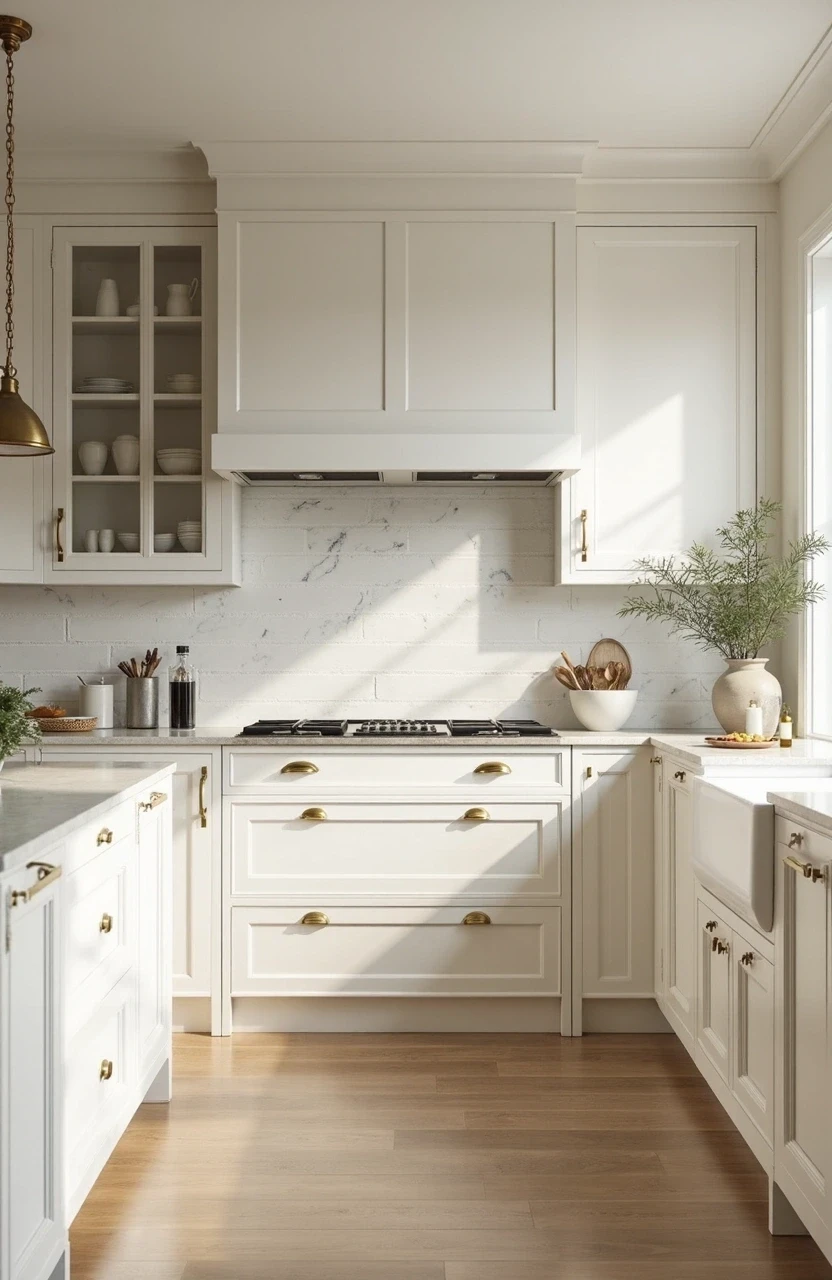
Classic White and Cream Schemes That Never Go Wrong
White kitchens aren’t going anywhere, and there’s a good reason for that. They’re timeless, they make spaces feel larger, and they work with virtually any style.
But not all whites are created equal.
The All-White Approach
- Cabinets: Pure white or off-white
- Countertops: White quartz with subtle veining or marble
- Backsplash: White subway tile or natural stone
- Hardware: Brushed nickel or polished chrome
This combination creates a clean, airy feel that’s perfect if you love a minimalist aesthetic. The key is adding texture through different materials – think honed marble counters with glossy subway tiles.
The Warm White Variation
- Cabinets: Cream or antique white
- Countertops: Warm-toned granite or butcher block
- Backsplash: Travertine or warm ceramic tiles
- Hardware: Oil-rubbed bronze or brass
This version feels more lived-in and cozy. It’s particularly beautiful in traditional or farmhouse-style homes.
The beauty of white schemes? They’re incredibly forgiving. You can switch up accessories, add colorful artwork, or change your mind about accent colors without starting from scratch.
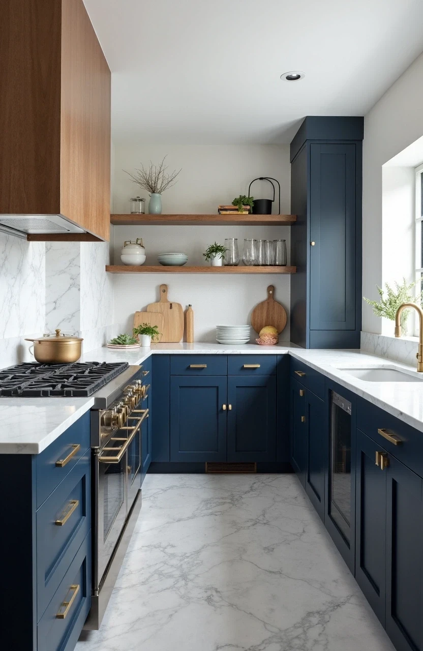
Bold and Beautiful: Navy and Dark Cabinet Solutions
Dark cabinets are having a major moment, and honestly, it’s about time. They add drama, sophistication, and create a stunning backdrop for lighter elements.
Navy cabinets, in particular, offer something special – they’re bold without being overwhelming.
The Navy and White Classic
- Cabinets: Deep navy blue
- Countertops: White quartz or light granite
- Backsplash: White or light blue subway tiles
- Hardware: Brass or brushed gold
This combination feels both traditional and fresh. The contrast between dark and light creates visual interest without being jarring.
The Moody Modern Look
- Cabinets: Charcoal or deep forest green
- Countertops: Dark granite or concrete
- Backsplash: Natural stone or dark ceramic
- Hardware: Matte black or dark bronze
This approach works beautifully in contemporary homes. It’s sophisticated and a little mysterious – perfect if you want your kitchen to feel like a high-end restaurant.
Pro tip: Dark cabinets work best in kitchens with plenty of natural light. If your space is on the darker side, consider using dark colors on an island while keeping upper cabinets light.

Warm Wood Tones and Natural Schemes
There’s something inherently comforting about wood in the kitchen. It brings warmth, texture, and a connection to nature that can’t be replicated with paint alone.
Wood-toned kitchens have evolved far beyond the honey oak of the ’90s. Today’s wood kitchens are sophisticated, varied, and absolutely stunning.
The Scandinavian-Inspired Look
Light wood cabinets pair beautifully with:
- Countertops: White quartz or light concrete
- Backsplash: White or light gray tiles
- Hardware: Matte black or brushed stainless steel
This combination feels fresh, clean, and effortlessly stylish.
The Rich Walnut Approach
Darker wood tones create depth and luxury:
- Countertops: Light granite or white marble
- Backsplash: Neutral stone or ceramic
- Hardware: Brushed brass or copper accents
The key with wood tones is balance. If your cabinets are the star, keep other elements more neutral to let the natural beauty shine through.
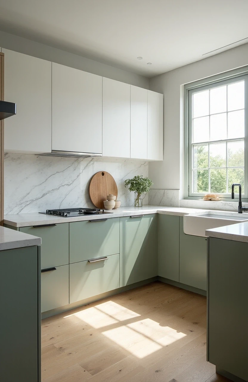
Two Tone Kitchen Magic: Upper and Lower Cabinet Combinations
Two-tone kitchens solve a problem many homeowners face: wanting both light and dark elements without committing fully to either.
This approach lets you have the best of both worlds.
Popular Two-Tone Combinations
| Upper Cabinets | Lower Cabinets | Best Countertop | Hardware Choice |
|---|---|---|---|
| White | Navy Blue | White quartz | Brass or gold |
| Light Gray | Charcoal | Light granite | Brushed nickel |
| Cream | Sage Green | Butcher block | Oil-rubbed bronze |
| White | Natural Wood | White marble | Matte black |
The general rule? Keep upper cabinets lighter to avoid making the space feel top-heavy. But rules are meant to be broken – in the right space, dark uppers can create stunning drama.
Making Two-Tone Work
- Choose colors from the same family for harmony
- Use your island as a third accent color if you’re feeling adventurous
- Let your backsplash bridge the two colors together
Countertop and Cabinet Coordination Secrets
Your countertops are like the foundation of your color scheme – everything else needs to work with this choice.
But here’s what most people get wrong: they try to match everything perfectly instead of creating contrast and interest.
Light Cabinets + Dark Countertops
This classic combination creates definition and sophistication:
- White cabinets with black granite
- Cream cabinets with dark soapstone
- Light gray cabinets with charcoal quartz
Dark Cabinets + Light Countertops
This approach keeps dark kitchens from feeling too heavy:
- Navy cabinets with white marble
- Forest green cabinets with light granite
- Charcoal cabinets with white quartz
Monochromatic Approaches
Sometimes, staying within the same color family creates the most sophisticated look:
- Gray cabinets with darker gray countertops
- Cream cabinets with warm beige granite
- White cabinets with subtle white quartz veining
Remember: Your countertops are a long-term investment. Choose something you love, then build your color scheme around it.
Backsplash Ideas That Tie Everything Together
The backsplash is where you can have some fun. It’s a relatively small area, so you can take risks you might not take elsewhere.
But it also serves an important function: connecting your cabinets and countertops visually.
Classic Subway Tile Variations
- 3×6 white subway: Works with everything, never goes out of style
- Colored subway: Add personality with sage, navy, or charcoal
- Textured subway: Handmade or crackled tiles add character
Natural Stone Options
- Marble slab: Luxurious and seamless
- Travertine: Warm and textural
- Slate: Modern and sophisticated
Creative Alternatives
- Metal tiles: Stainless steel or copper for industrial chic
- Glass mosaics: Reflect light and add sparkle
- Painted glass: Clean, modern, available in any color
The key is choosing something that complements your dominant colors without competing for attention.
Hardware: The Jewelry of Your Kitchen
Cabinet hardware might seem like a small detail, but it’s actually crucial to your overall color scheme. Think of it as jewelry for your kitchen – it can elevate the entire look or throw everything off balance.
Finish Options and When to Use Them
Brushed Nickel: The safe choice that works with almost everything
- Best with: White, gray, or navy cabinets
- Avoid with: Very warm color schemes
Brass and Gold Tones: Having a major comeback moment
- Best with: Navy, green, or cream cabinets
- Pairs beautifully with marble countertops
Matte Black: Modern, sophisticated, dramatic
- Best with: White or light-colored cabinets
- Creates stunning contrast in contemporary kitchens
Oil-Rubbed Bronze: Warm, traditional, slightly rustic
- Best with: Cream, sage, or wood-toned cabinets
- Perfect for farmhouse or traditional styles
Mixing Metals (Yes, You Can!)
The old rule about matching all your metals? Forget it. Mixing metals adds depth and interest to your kitchen. Just follow these guidelines:
- Stick to two, maximum three, metal finishes
- Repeat each metal at least twice in the space
- Make sure they share similar undertones (all warm or all cool)
Color Schemes for Small vs. Large Kitchens
The size of your kitchen absolutely affects which color schemes will work best. What looks stunning in a spacious open-plan kitchen might feel overwhelming in a cozy galley space.
Small Kitchen Strategies
Light and Bright Approach:
- Keep cabinets light to reflect natural light
- Use the same color on uppers and lowers for continuity
- Choose glossy finishes that bounce light around
- Limit contrast to avoid chopping up the space visually
Smart Small Kitchen Combinations:
- All white with stainless steel accents
- Light gray with white countertops
- Cream cabinets with warm wood accents
Large Kitchen Opportunities
Bold and Dramatic:
- Dark colors won’t overwhelm the space
- You can handle more contrast and complexity
- Multiple color zones work well
- Statement backsplashes make sense
Effective Large Kitchen Schemes:
- Navy and white with brass accents
- Two-tone combinations with bold island colors
- Rich wood tones with dramatic countertops
The key is working with your space, not against it.

Putting It All Together: A Step-by-Step Approach
Ready to create your own knockout kitchen color scheme? Here’s a foolproof method:
Step 1: Choose Your Hero Element
This is usually your countertops or cabinets – whichever you’re most excited about or costs the most to change.
Step 2: Select Your Supporting Cast
Pick 2-3 complementary colors that work with your hero element. Use the 60-30-10 rule:
- 60% dominant color (usually cabinets)
- 30% secondary color (countertops or backsplash)
- 10% accent color (hardware, accessories)
Step 3: Consider Your Lighting
- North-facing kitchens need warm colors to counteract cool light
- South-facing spaces can handle cooler colors
- LED vs. warm incandescent bulbs affect how colors appear
Step 4: Test Everything Together
- Get samples of all materials
- View them in your actual kitchen lighting
- Live with them for a few days before deciding
Step 5: Think Long-Term
- Will you still love this in 5-10 years?
- Does it work with your home’s overall style?
- Can you easily update accessories and accents?
Trending Color Combinations for 2025 and Beyond
While classic combinations never go out of style, it’s fun to know what’s fresh and current. Here are the color schemes that are having a moment:
Sage Green and Warm Brass
This earthy combination feels both trendy and timeless. Sage green cabinets with brass hardware and warm marble countertops create a sophisticated, nature-inspired look.
Deep Forest Green with Natural Wood
Richer than sage, forest green paired with light wood tones and cream accents feels luxurious and grounded.
Warm Grays with Black Accents
Moving away from the cool grays of the past decade, warmer gray tones paired with matte black hardware feel current and sophisticated.
Cream and Caramel Tones
A return to warmer neutrals, this combination uses varying shades of cream and caramel for a cozy, layered look.
The beauty of these trending combinations? They’re rooted in classic principles, so they won’t feel dated in a few years.
Your Kitchen, Your Rules
Creating a kitchen color scheme that works isn’t about following every design rule perfectly. It’s about understanding the principles and then adapting them to your life, your space, and your style.
The most beautiful kitchens are the ones that feel authentic to the people who use them every day. So whether you go bold with navy and brass or keep it classic with white and stainless steel, make sure it feels like you.