
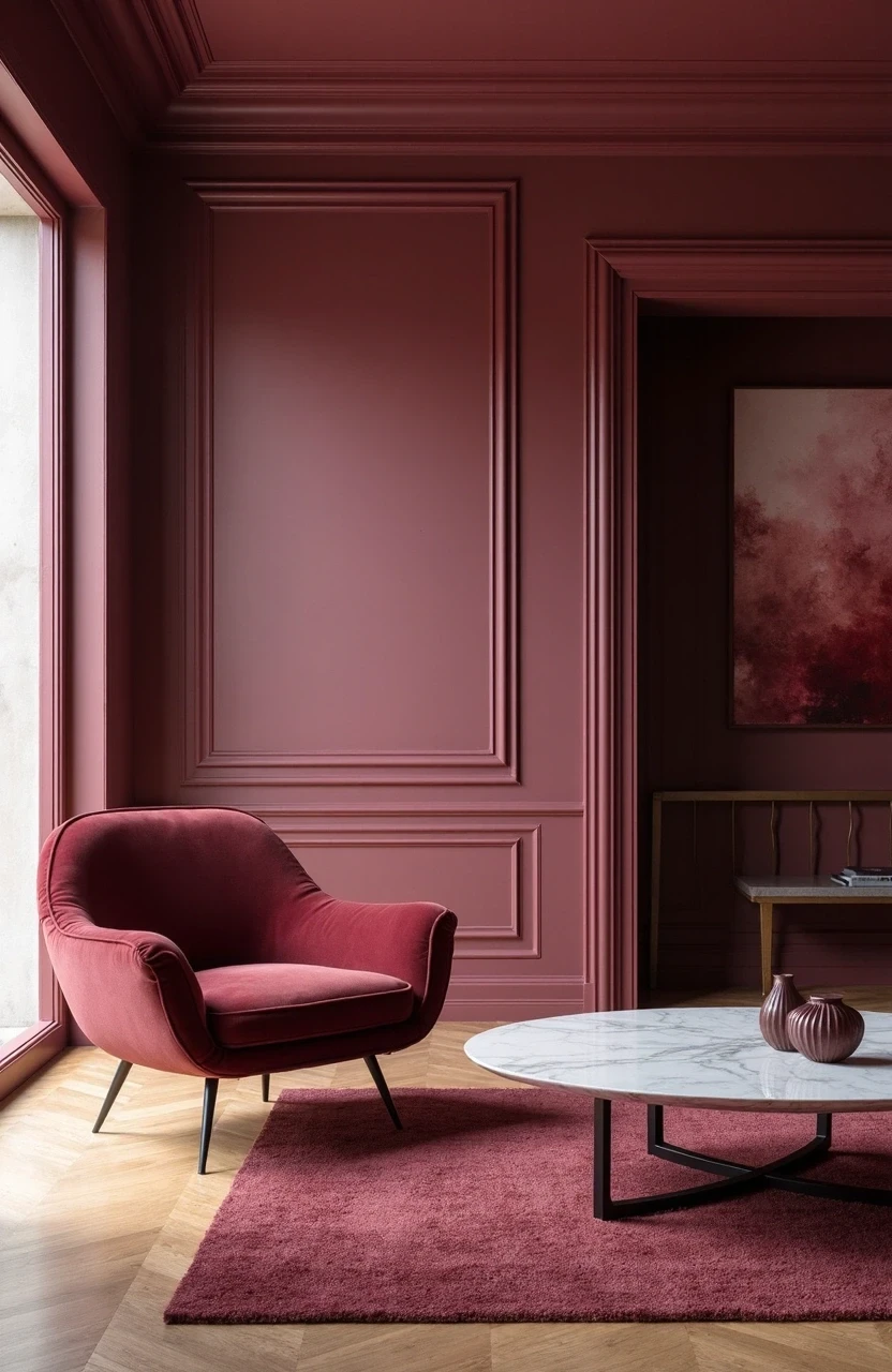
Same Color Trim And Walls Living Room Ideas That’ll Make Your Space Look Effortlessly Chic
You know that feeling when you walk into a room and something just feels… off?
Nine times out of ten, it’s the trim situation.
Those stark white baseboards screaming against your carefully chosen wall color. The crown molding that looks like it belongs in a different house entirely.
Same color trim and walls living room designs aren’t just trendy, they’re genius. They create this seamless, sophisticated flow that makes your space feel larger, more cohesive, and honestly? Way more expensive than it probably was.
We’re talking about 17 ideas that’ll transform your living room from “nice enough” to “magazine-worthy.” From moody charcoal schemes to soft sage sanctuaries, each approach brings something different to the table.
Ready to ditch the contrast drama for something more refined?
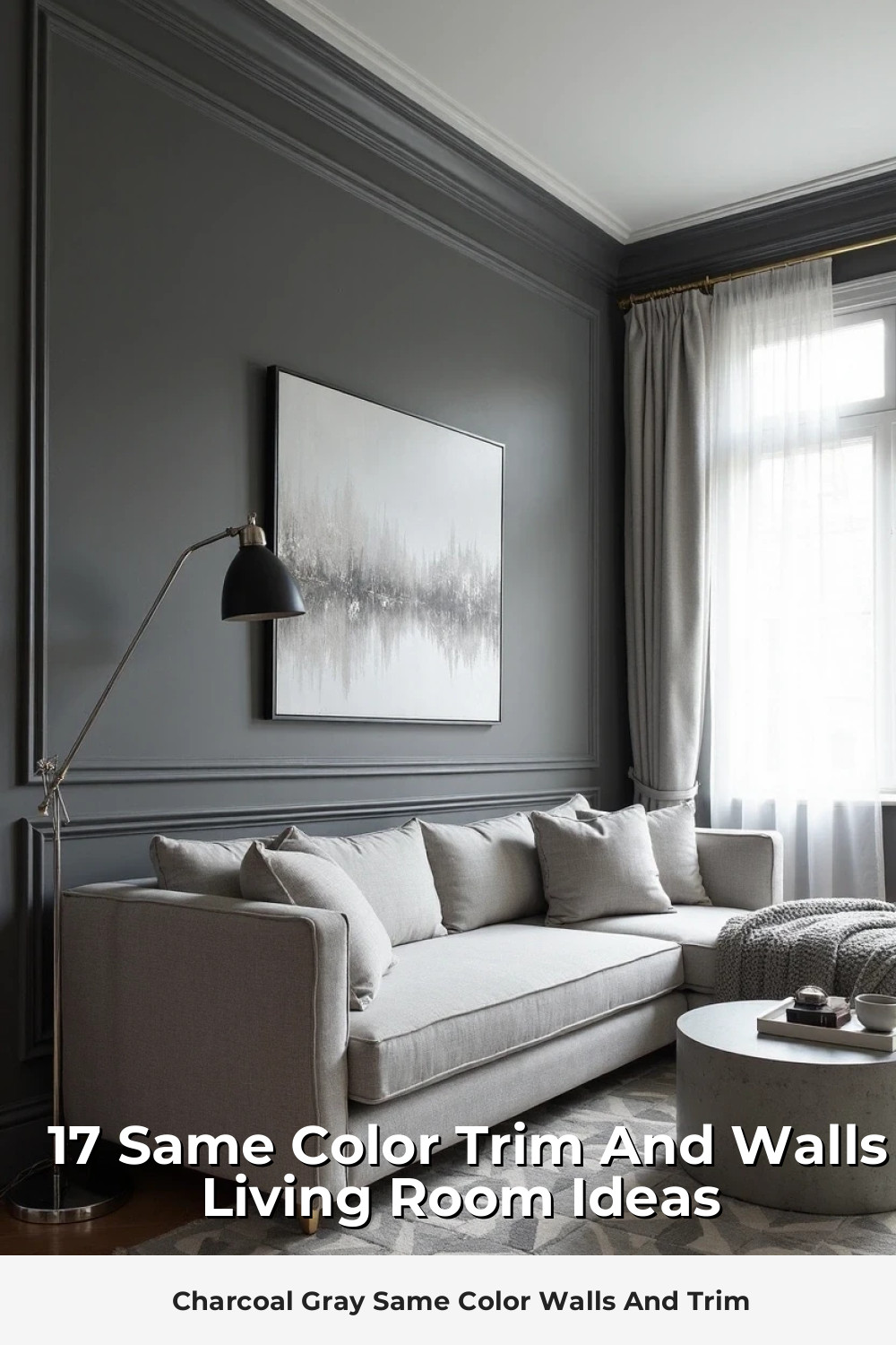
Charcoal Gray Same Color Walls And Trim
Dark and dramatic doesn’t have to mean dungeon-like. When you paint both your walls and trim in the same rich charcoal gray, magic happens.
The monochromatic approach creates depth through texture rather than color contrast. Your furniture becomes the star, and architectural details get this subtle, sophisticated definition that white trim could never achieve.
- Best furniture pairings: Cream leather sofas, warm wood coffee tables, brass accents
- Lighting considerations: Layer warm white LED bulbs at 2700K for cozy ambiance
- Texture additions: Chunky knit throws, jute rugs, linen curtains
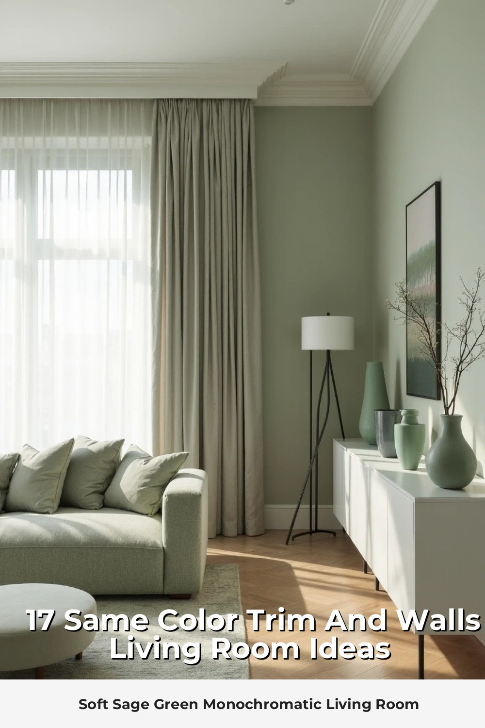
Soft Sage Green Monochromatic Living Room
Sage green is having a moment, and for good reason. This earthy, calming hue works beautifully when carried from walls to trim, creating a cocoon-like atmosphere that’s both trendy and timeless.
The key is choosing the right undertone – you want something with enough gray to keep it sophisticated, not so yellow that it screams “hospital waiting room.”
Navy Blue Walls With Matching Trim
Navy is basically the little black dress of paint colors. Elegant, versatile, and surprisingly neutral when you commit fully.
Pro tip: Navy same-color schemes work best in rooms with plenty of natural light. South-facing windows are your friend here.
Your brass fixtures will pop against this backdrop like jewelry against a well-cut suit. And don’t even get me started on how gorgeous white and cream furniture looks floating in all that rich color.
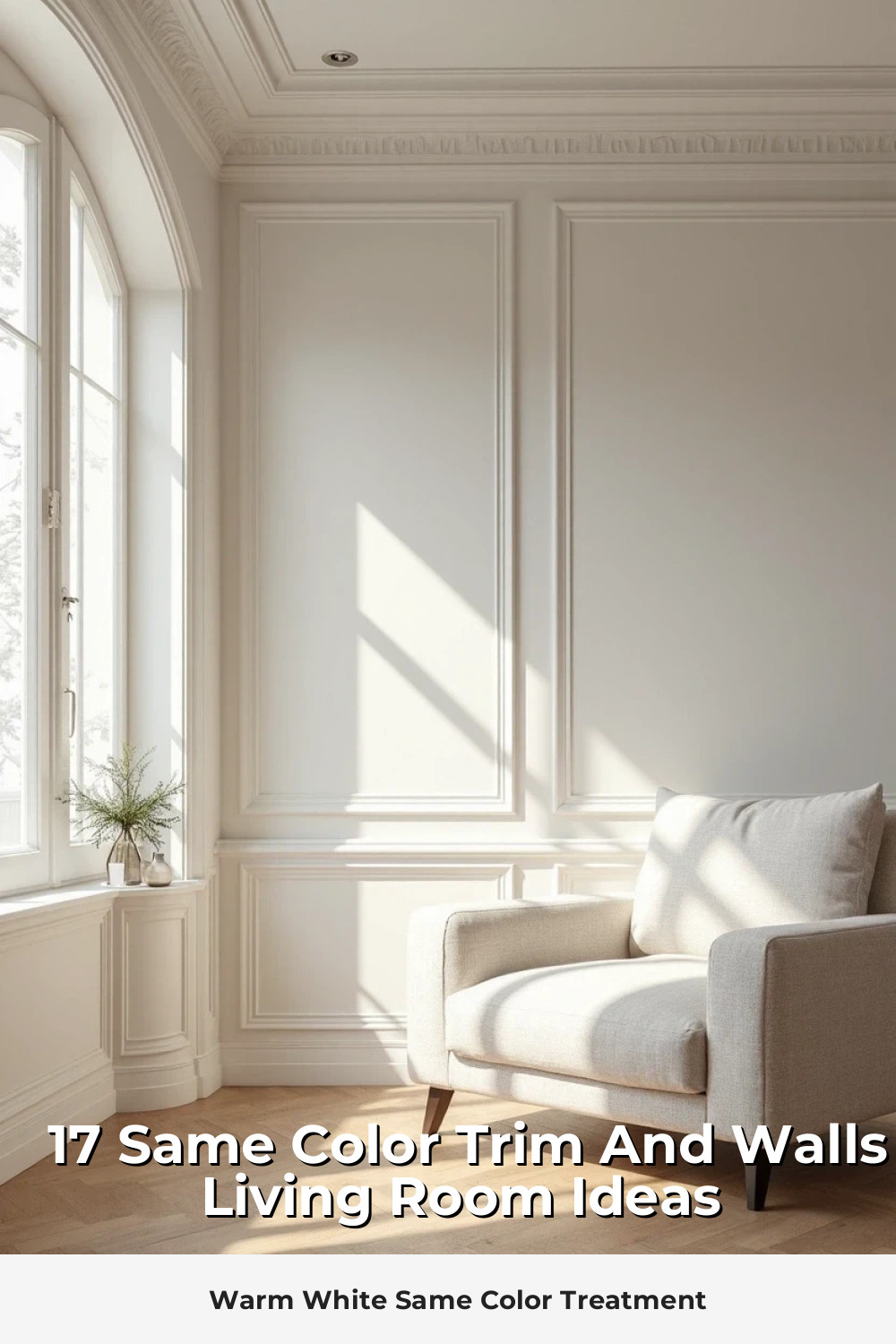
Warm White Same Color Treatment
Before you roll your eyes and think “boring,” hear me out. Warm white walls and trim create this expensive, gallery-like backdrop that lets everything else in your room shine.
- Choose whites with undertones that complement your lighting
- Consider the room’s exposure – north-facing rooms need warmer whites
- Layer different textures to prevent the dreaded “sterile” look
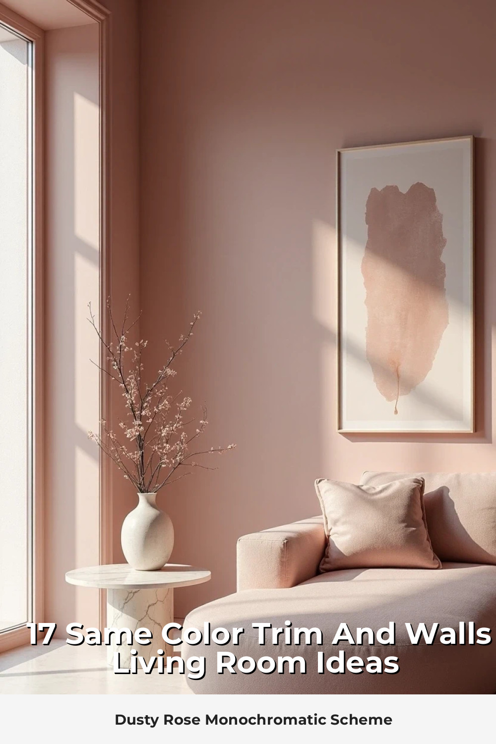
Dusty Rose Monochromatic Scheme
Pink in the living room? Absolutely. But we’re talking dusty rose – that sophisticated, grown-up pink that whispers rather than shouts.
This same-color approach works especially well in rooms with vintage or bohemian styling. Think velvet sofas, antique brass frames, and plenty of plants to balance the femininity.
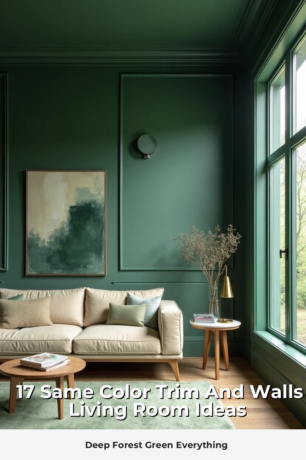
Deep Forest Green Everything
Forest green creates this cocooning effect that’s both dramatic and surprisingly restful. When you carry it across walls and trim, the room feels like a sophisticated retreat.
The trick is balancing all that richness with lighter elements – cream upholstery, natural wood tones, and plenty of metallic accents to catch and reflect light.
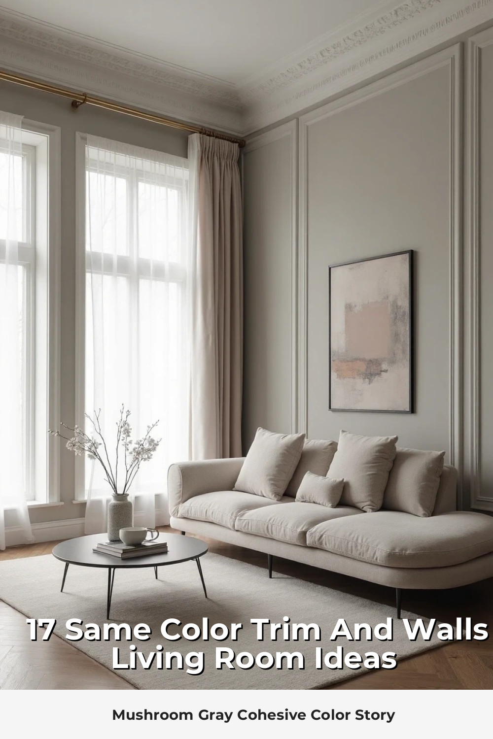
Mushroom Gray Cohesive Color Story
Mushroom gray hits that sweet spot between beige and gray – warm enough to feel inviting, cool enough to feel current.
This neutral same-color treatment works with virtually any decorating style:
- Modern: Clean lines, minimal accessories, statement lighting
- Traditional: Rich fabrics, layered rugs, collected antiques
- Transitional: Mix of old and new, comfortable sophistication
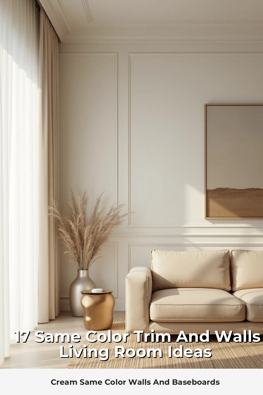
Cream Same Color Walls And Baseboards
Cream is white’s more interesting cousin. It has personality, warmth, and this ability to make everything look more expensive.
When you paint both walls and trim in the same cream shade, you create this seamless backdrop that feels both classic and contemporary. Natural materials like rattan and wood look incredible against this neutral canvas.
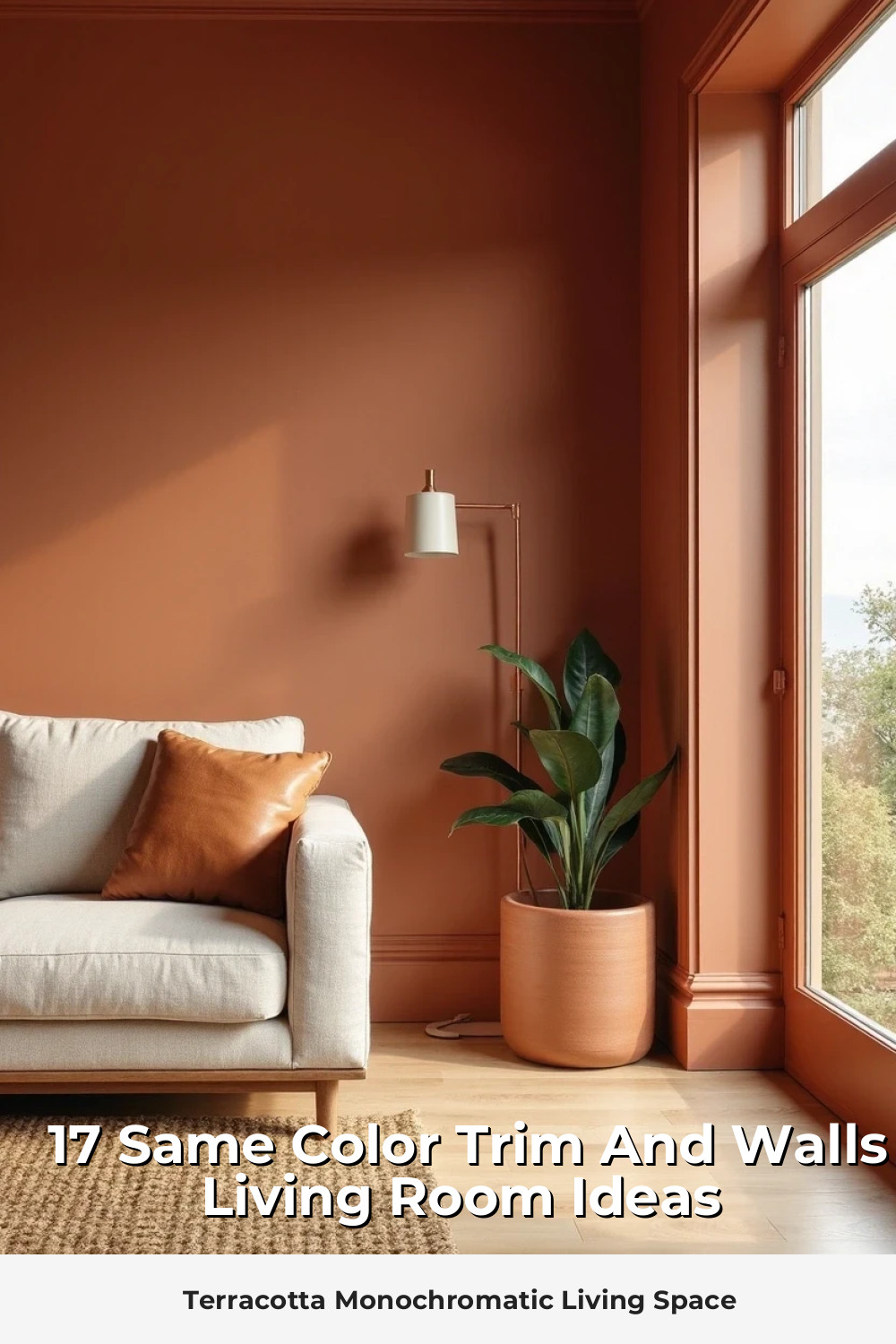
Terracotta Monochromatic Living Space
Terracotta brings warmth and earthiness that’s impossible to achieve with cooler colors. This same-color approach creates a sunset-like glow that makes everyone look better.
Style notes: Pairs beautifully with natural textures, vintage leather, and plenty of greenery. Think California casual meets European sophistication.
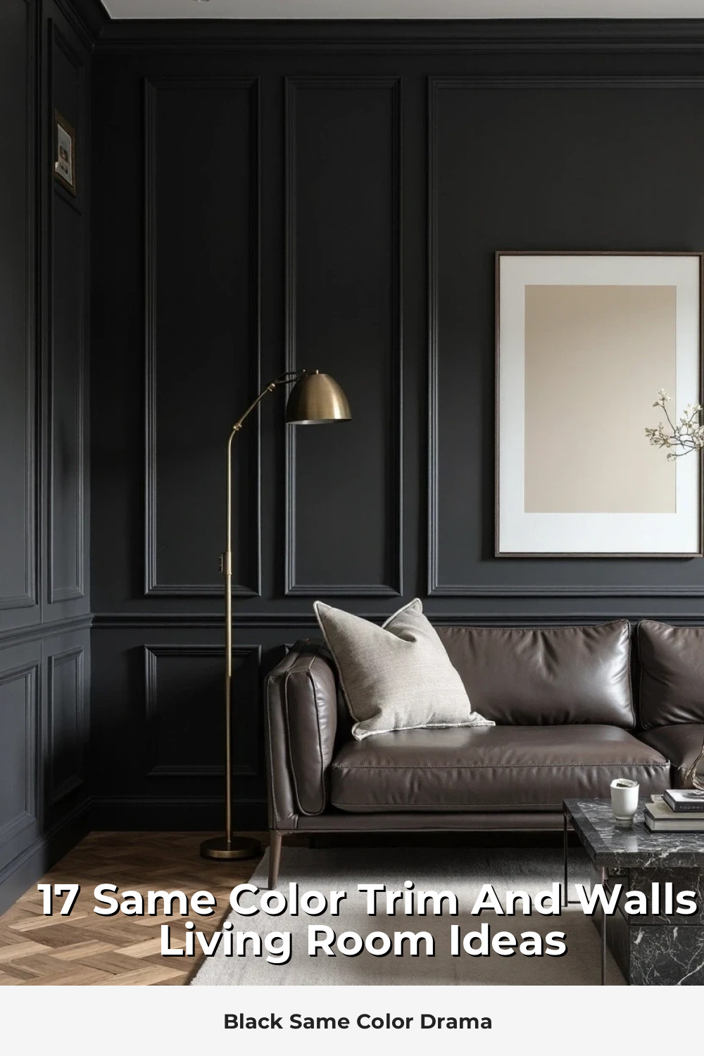
Black Same Color Drama
Yes, black walls and trim in a living room. And yes, it can be absolutely stunning.
The key is treating black as a neutral (which it is) and building layers of texture and metallic accents. Your art will pop, your furniture will float, and your room will feel infinitely more expensive.
- Essential additions: Multiple light sources, mirrors, light-colored furniture
- Avoid: Heavy, dark furniture that disappears into the walls
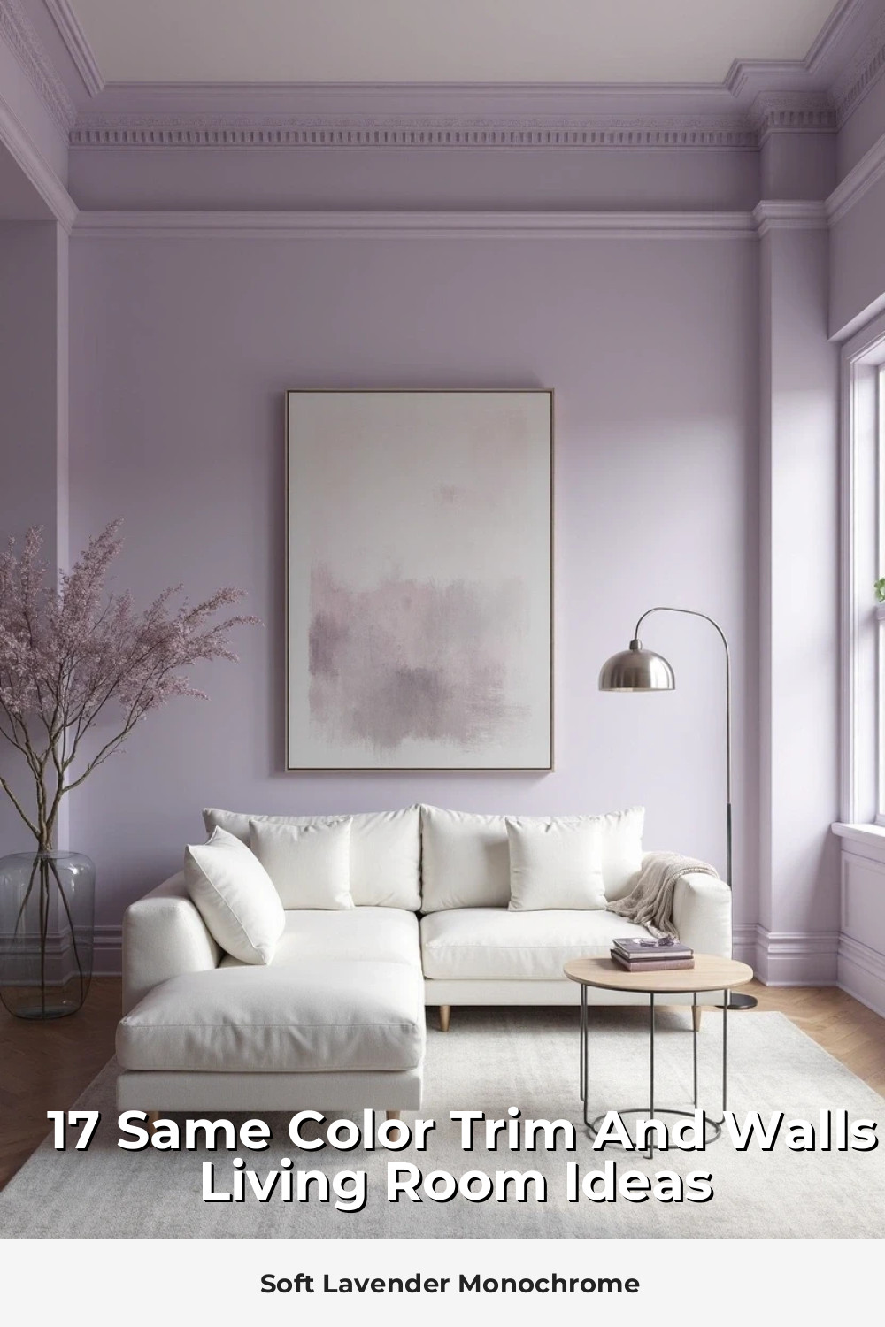
Soft Lavender Monochrome
Lavender isn’t just for bedrooms anymore. When used in a same-color wall and trim treatment, it creates this dreamy, sophisticated atmosphere that’s both calming and unexpected.
Choose a lavender with gray undertones rather than pink ones for a more grown-up feel.
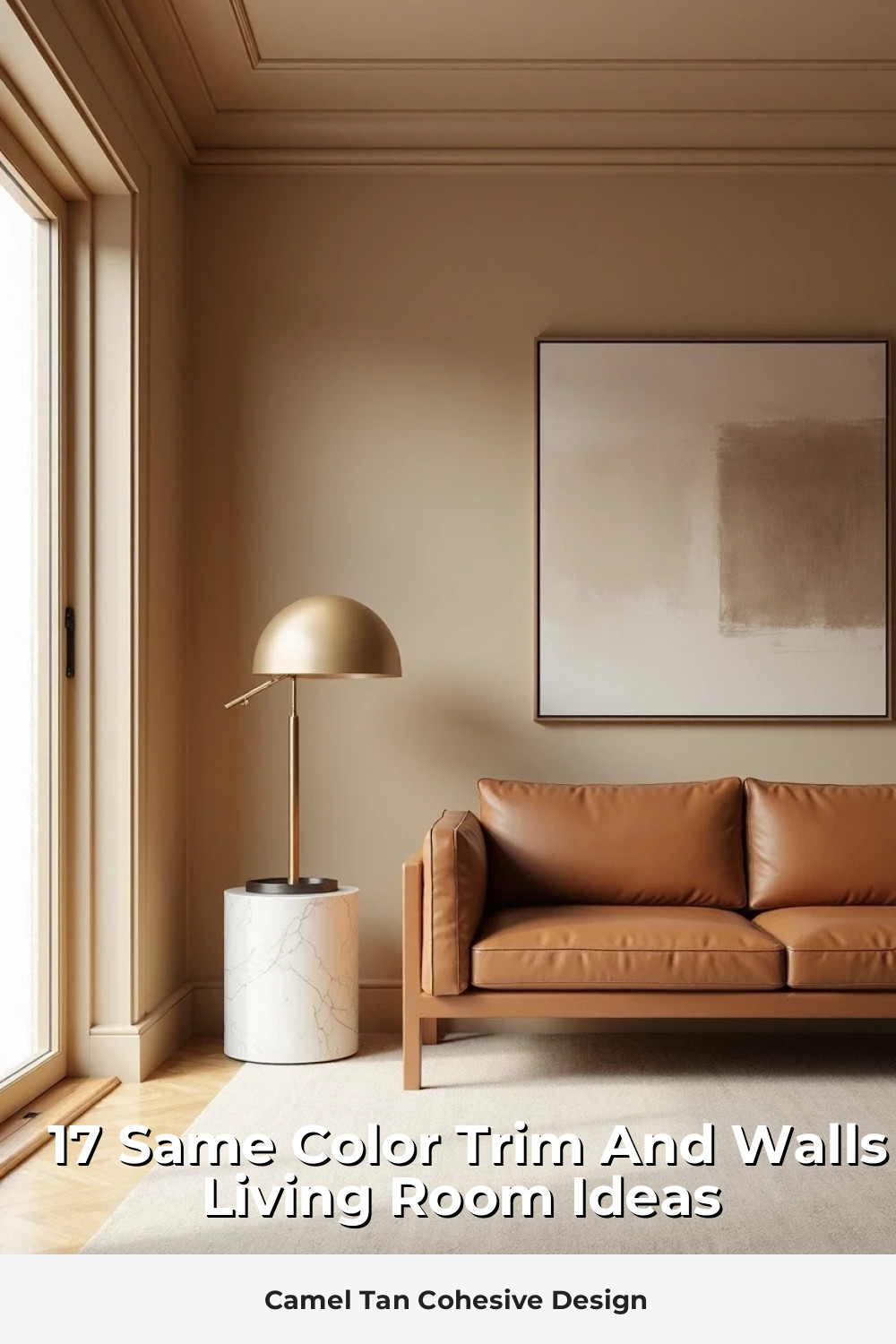
Camel Tan Cohesive Design
Camel tan creates this warm, enveloping feeling that’s like a cashmere sweater for your walls. The monochromatic approach prevents it from feeling too “safe” or boring.
This color works beautifully with both warm and cool accent colors – navy and white for a preppy vibe, or deep burgundy and forest green for something more dramatic.
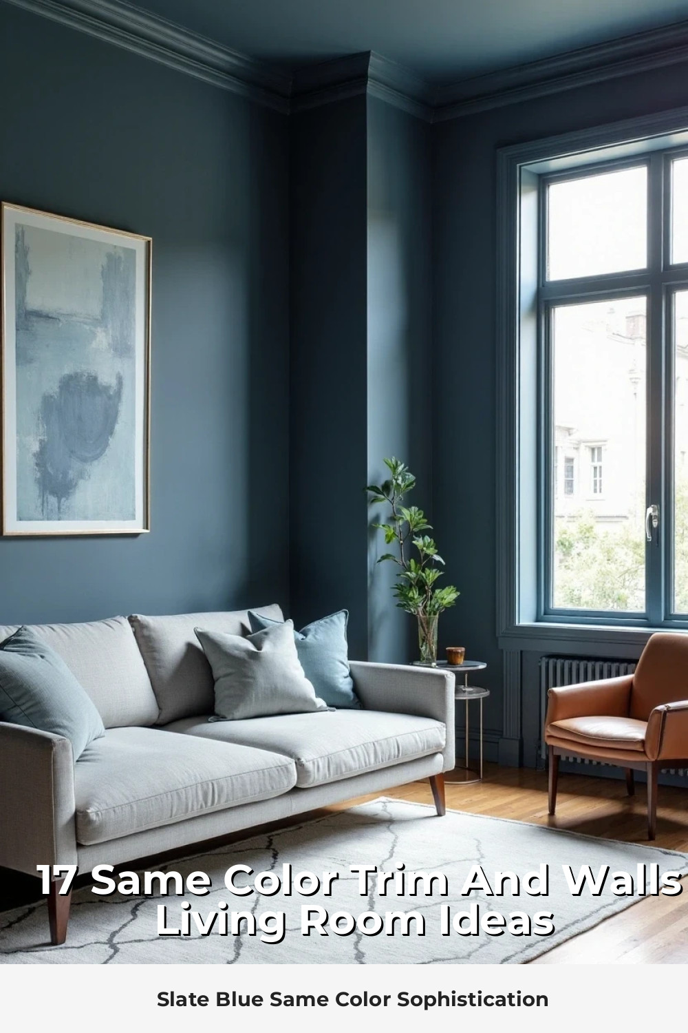
Slate Blue Same Color Sophistication
Slate blue occupies this perfect middle ground between navy and gray. It’s sophisticated without being stark, colorful without being overwhelming.
When carried across walls and trim, it creates this cohesive backdrop that works with virtually any furniture style. Industrial metals, warm woods, vintage textiles – everything looks intentional against slate blue.
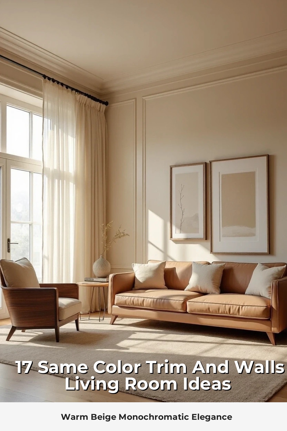
Warm Beige Monochromatic Elegance
Beige gets a bad rap, but the right warm beige can be incredibly chic. The same-color treatment prevents that “contractor special” look and instead creates something that feels curated and intentional.
- Key to success: Choose beige with clear undertones – pink, yellow, or gray
- Avoid: Muddy beiges that look different under various lighting conditions
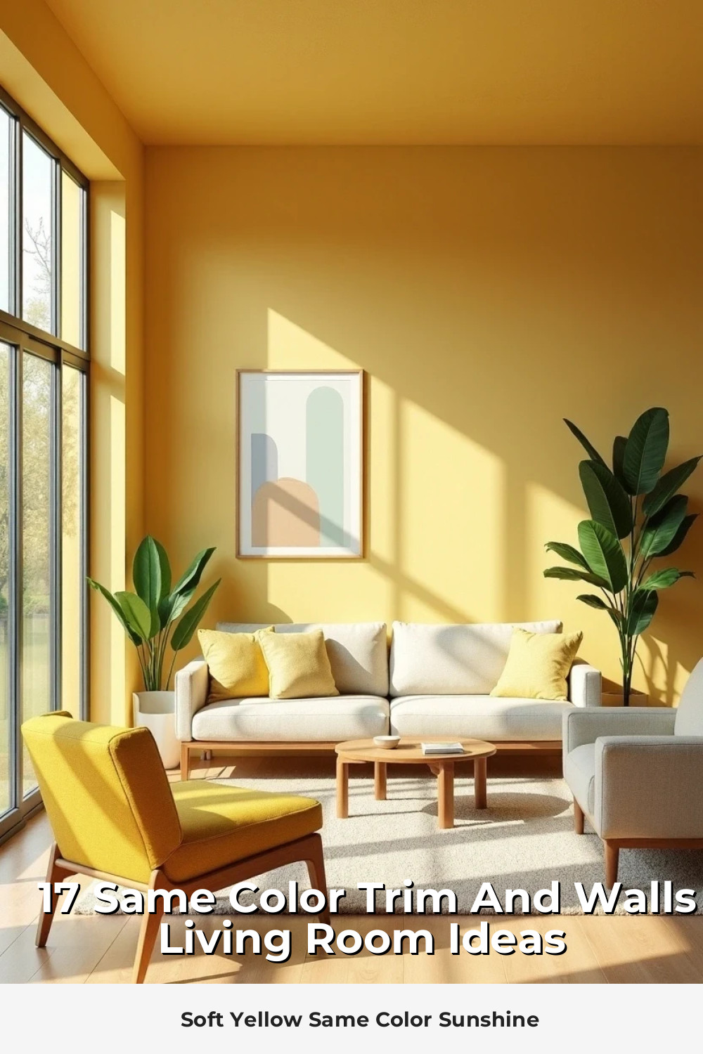
Soft Yellow Same Color Sunshine
Soft yellow walls and trim create instant happiness. But we’re not talking about school bus yellow – think more like morning sunlight or fresh butter.
This same-color approach keeps the yellow from overwhelming while still delivering that mood-boosting warmth. Perfect for rooms that don’t get much natural light.
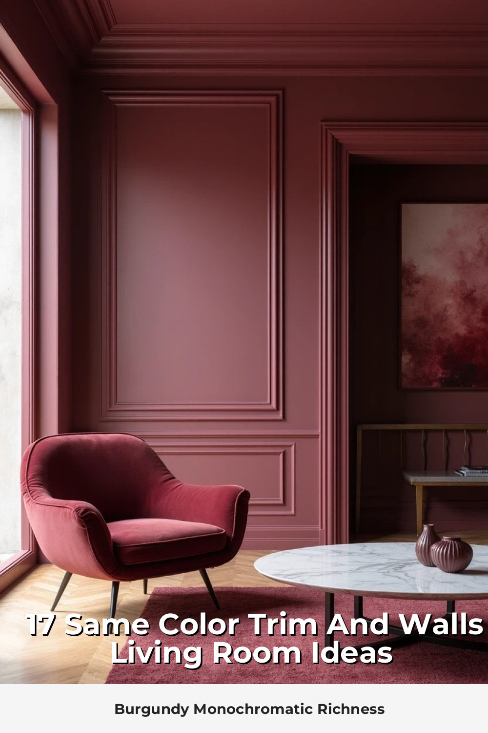
Burgundy Monochromatic Richness
Burgundy is sophisticated, cozy, and completely unexpected in a living room. When you commit fully with same-color walls and trim, it creates this jewel-box effect that’s absolutely stunning.
Styling tip: Balance the richness with plenty of metallic accents and light-colored upholstery. Gold, brass, and cream are your best friends here.
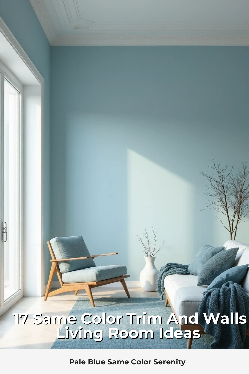
Pale Blue Same Color Serenity
Pale blue creates this serene, spa-like atmosphere that’s perfect for modern living. The same-color treatment keeps it from feeling too “baby nursery” and instead delivers sophisticated calm.
This color works especially well in coastal or Scandinavian-inspired spaces, paired with natural textures and minimal accessories.